Real-Time KPI Dashboard & Reporting for Automotive Teams
My Role: Designer, Researcher
Team: Design, Front-end Engineer, Back-end Engineer, QA
Duration: 3 months
01 The Brief
02 Empatise
03 Define
04 Ideation
05 Design
06 Testing
The Brief
The goal is to design a user-friendly, real-time experience for sales teams and service managers, giving quick access to dashboards, reports, and widgets. The UX prioritises usability, accessibility, and day-to-day tasks, while the UI aligns with the existing style and is customisable to meet customer needs.
My Contribution
I led user research, defined user flows and information architecture and designed wireframes and prototypes tailored to user roles. I validated designs through usability testing, iterated based on feedback and worked closely with engineers and QA to ensure the solution was delivered as envisioned.
“This project went beyond just design—it was also about defining rules for what data is shown based on the users role, ensuring the dashboards were both functional and meaningful.”
EMPATHISE
User Interviews & Surveys
I asked 2 users groups about the specific data they want to see on the dashboards, I engaged directly with them to uncover their expectations, pain points, and priorities regarding data visualisation and reporting. This insight helped me to define the scope and requirements for the dashboard design, ensuring that the final solution met user needs.
“Real-time reporting is key to quick, informed decisions. Without it, we risk missing opportunities. Your software must deliver real-time data.”
Primary Research - Group 1:
Due to user availability, research was split into two parts. The first involved visiting a key client to interview SMT and department managers, gathering valuable insights on the most important data for them.
Primary Research - Group 2:
The second part involved a remote survey with selected users to identify the specific data they wanted on the dashboards.
“To stay competitive, I need clear visibility on both individual salesperson performance and overall team sales. I need KPI solution shows this.”
DEFINE
Brainstorming
I asked target users to share their experiences with the existing reporting system and introduced a dashboard concept. Through a brainstorming session, users participated in a group discussion where they provided examples of their processes and how they envisioned a dashboard solution benefiting them.
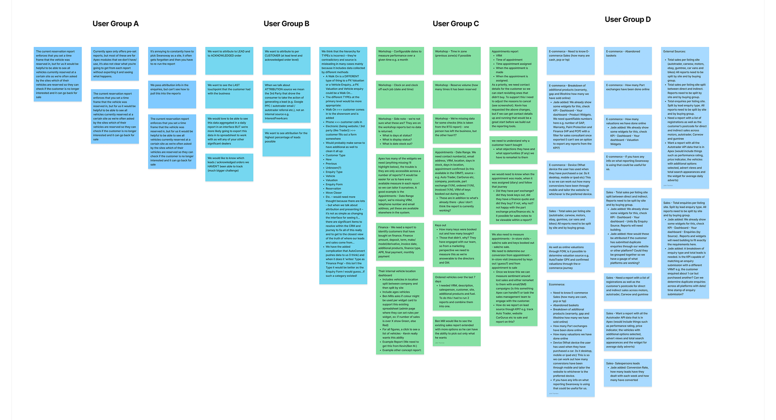
I created a Affinity Map, gathering raw data – quotes, observations, pain points, etc and wrote each item on a digital sticky note.
DEFINE
Software Requirements & User Story
As part of this project, I collected user stories and requirements through interviews, surveys, and group discussions. These insights defined the key needs and features for the dashboard solution, ensuring it aligns with user goals and expectations.
“Ideation is where we turn user insights into possibilities. I needed dashboards which help users get things done."
IDEATION
1 of 4: What Will The User Flows Be?
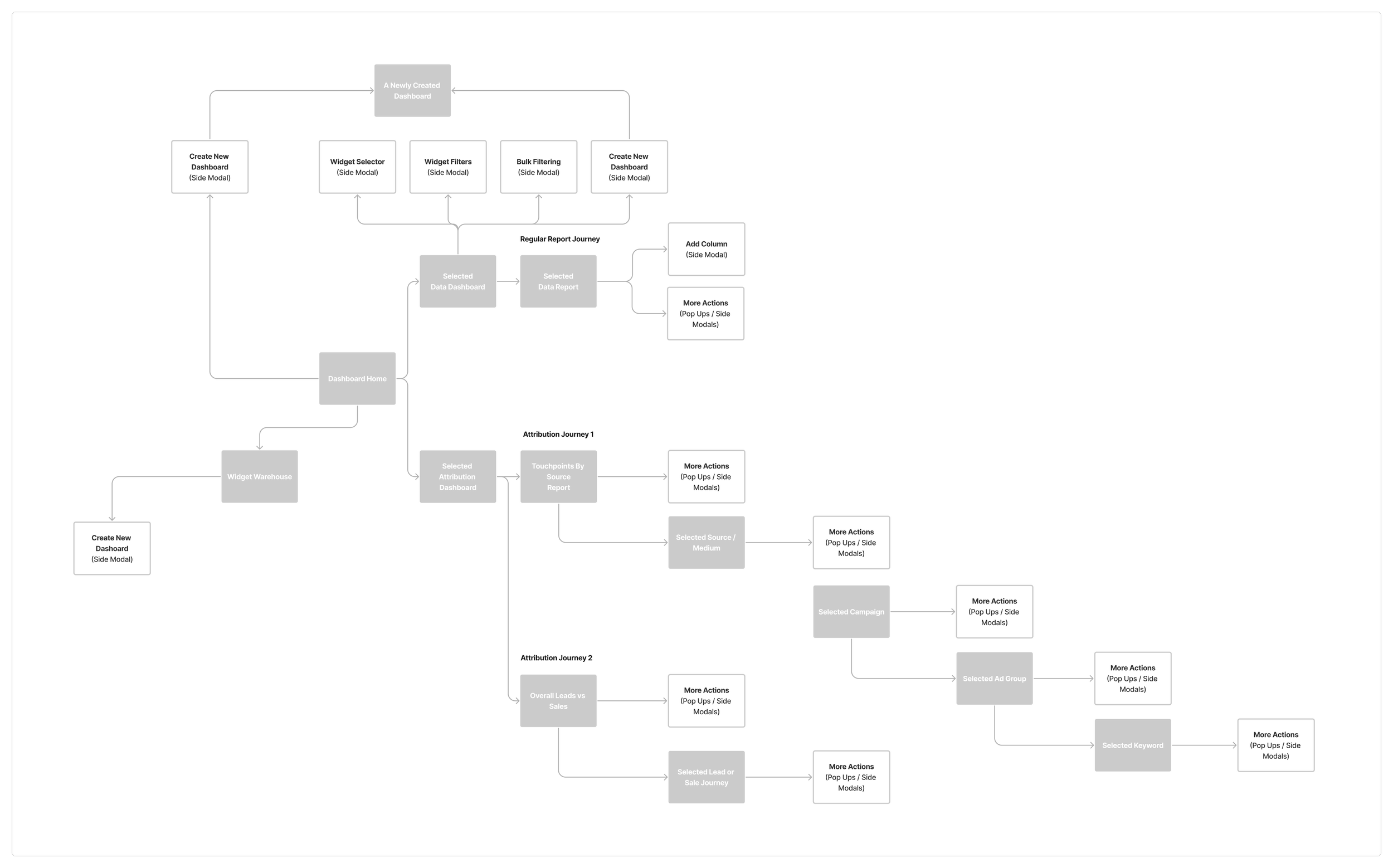
Screenshot of user flow planning, the overview of navigation structure.
Dashboard focus, determining what action should be available when them.
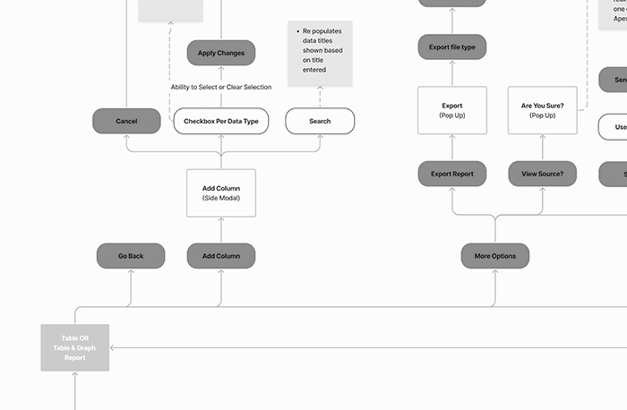
A similarity for reports. Exporting, filtering and sort by functionality.
IDEATION
2 of 4: Identifying Dashboard Creators
Each dashboard card should offer options based on the creator type, support user group tagging to control visibility, and allow filtering by user groups for quicker discovery. Here are some notes from that thought process
Description
Pre built dashboards for launch created by Apex, based on what we know to be important, influencing users to start using dashboards more.
After launch, an individual user creates a dashboard they feel others will benefit from seeing, this is a shared dashboard.
After launch, an individual user creates a dashboard they feel others will benefit from seeing, this is a shared dashboard.
Creator type
By Apex
By User (Shared with You)
By You (Private to You)
Options for creator
View, share* and create new all based on user permissions
View, reshare*
View, reshare*
IDEATION
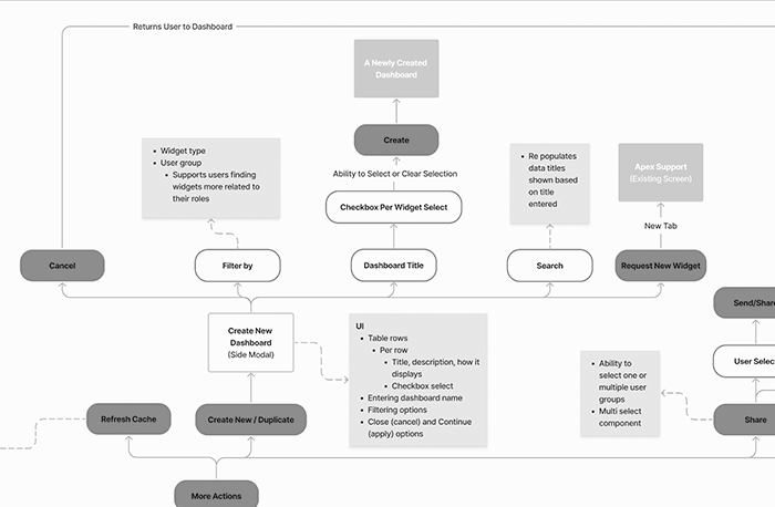
3 of 4: How Should Dashboards Be Created?
I define the best way to create dashboards, focusing on two different flows that reflect how users build and customise dashboards based on their roles and preferences.

Approach 1 - A drag and drop builder where the user creates the dashboard first and add’s widget or interest next.

Approach 2 - A widget list builder concept where widgets are selected first and creates a dashboard next.
IDEATION
4 of 4: What Makes A Useful Widget Card?
I focused on the dashboard grid and widget cards—structuring, defining behaviour, understanding limitations, and setting interactions. Here were my notes:
Movement
Must be able to move cards for reordering
Must have clear signifier to for drag and drop which should include both grab-handle icon and/or cursor changes
Must show a grab-handle icon on widget cards during hover state.
Resizeable
Must be able to resize a widget card
Must have a clear signifier to for selecting and holding the edge
Must be able to select and hold card edges, allowing the widget card be resized along two dimensions at once (both width and height).
Must consider rules per breakpoint to control under and over sizing of widgets, setting minimum and maximum rules to promote best usage and support user decisions
Accessibility
Important the solution considers users that use assistive technologies in important
Must display message to screen readers for what actions are available, confirming card state (default or grabbed), current position when interacting with dashboards
Must allow arrow keys to move and resize widget cards
DESIGN
Low-Fidelity Wire Frames
I created low-fidelity wireframes to help me to plan the layout and arrangement of interface elements, focusing on structure and functionality without spending time on visual details so soon.
“I prefer low-fidelity wireframes because they present ideas quickly and invite more honest feedback.”

Wireframes showing planning for a KPI landing page displaying dashboards with focus on user permissions and filtering and filtering view where data maybe added to a report.

Generic dashboard planning, focusing on options available per widget card and per dashboard. Another filtering screen to manage widget cards data.

Two early concepts that didn’t make it into the final product. The first was a warehouse of widgets, I wanted to create a marketplace feel, showcasing available widgets, upcoming ones, and allowing users to request, search, and view where widgets had already been applied. The second was a widget add/remove modal that let users drag and drop widgets onto their dashboard with immediate effect. This was later considered a “nice to have” for a future release.
DESIGN
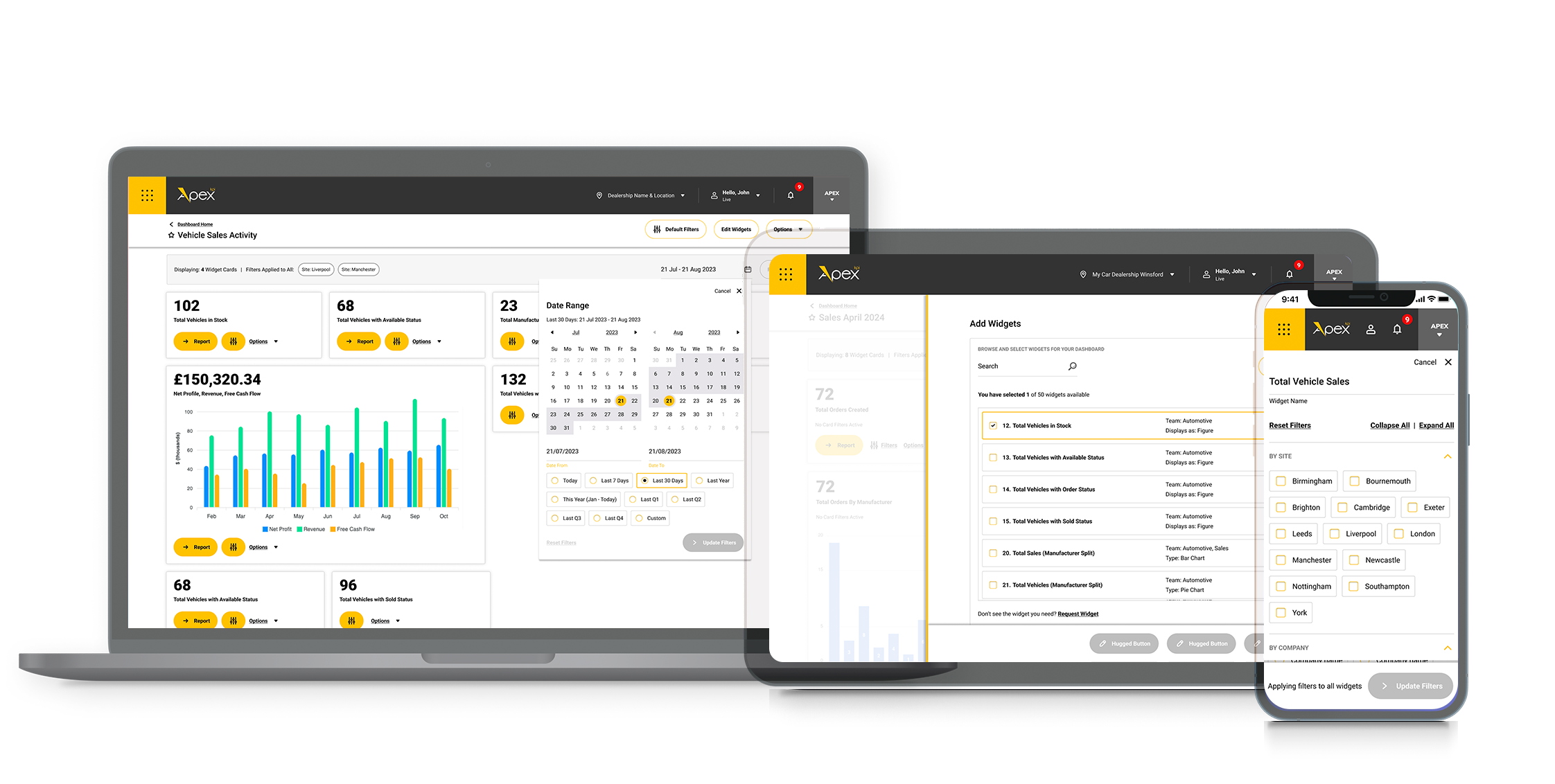
User Interface Design
After the wireframes were approved, I proceeded with designing the final screens and applied the user interface for desktop, tablet and mobile.

The dashboard home, all dashboards discoverable in one new home, with view by and filter by options.
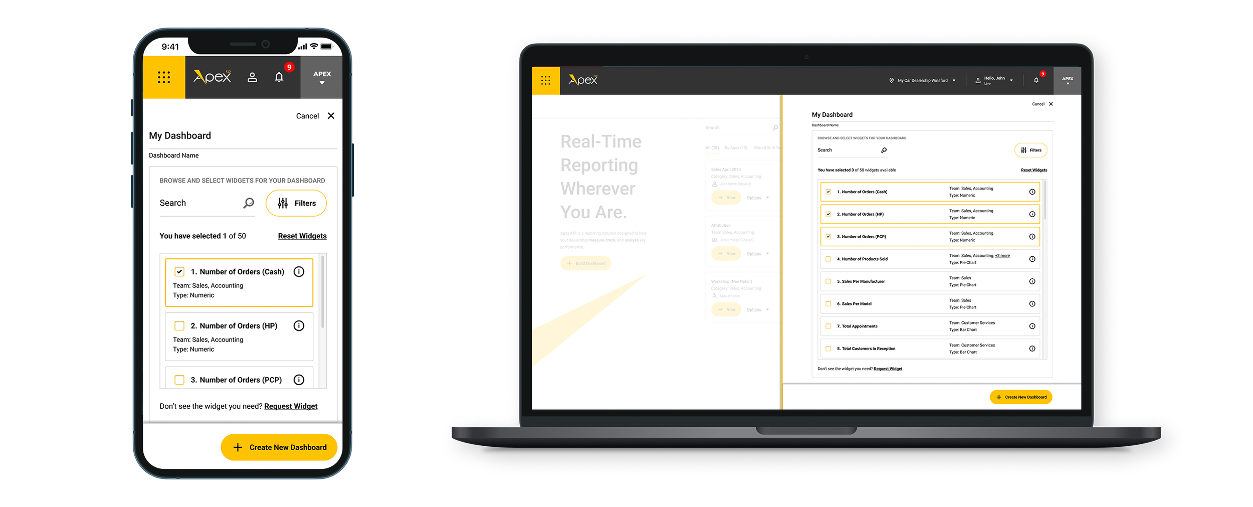
Create dashboard experience allows users to filter by department or subject.
Customise your dashboard after built to keep it relevant. Edit widgets shown, how they display, the ordering and sizing of widgets.
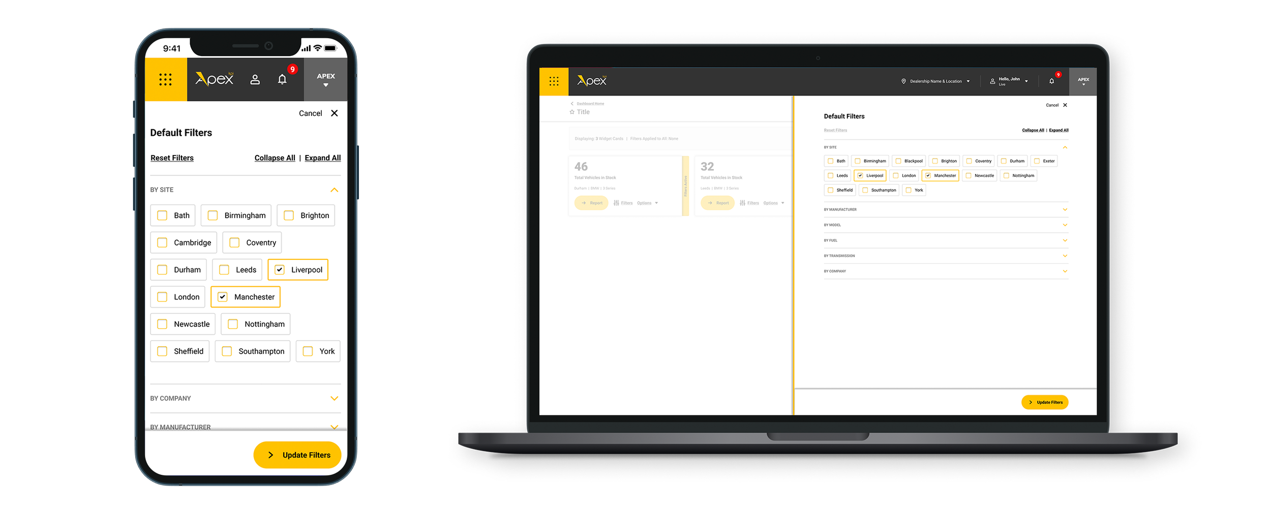
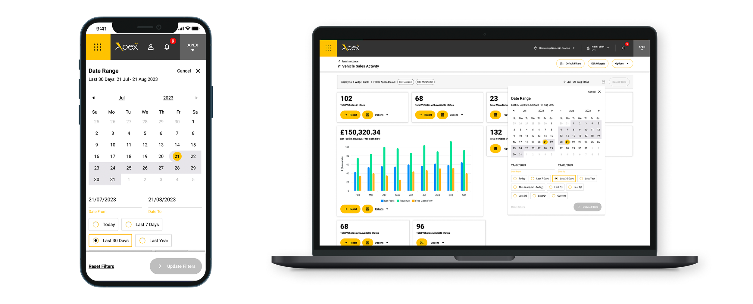
Filter dashboard data globally or per widget card. This date range component was created inspired by research and user feedback.
DESIGN
Alternative Theme’s Considered
Alternative dark contrast and glass-inspired themes were also suggested during the design phase as examples of how users might further tailor their views.


TESTING
Guerrilla Testing
I conducted guerrilla testing as a quick, informal, and cost-effective method in public spaces. I randomly selected participants, who might not have matched our target audience, and kept the setup minimal. This allowed me to gather fast, early-stage feedback with minimal effort.
Task-Based Usability Testing
I conducted task-based usability testing with target users to assess how easily they could complete key actions, providing insights to refine the dashboard design.
I conducted testing sessions where you provide users with a set of instructions to complete core actions within the high-fidelity prototype.
Observe how easily users can navigate, create dashboards, discover their widget card choices and apply them to a their own dashboard, and perform other essential actions.
Gather feedback on user interface design, clarity of labels and instructions, and overall user experience.