Building a Scalable Automotive Design System
My Role: Designer
Team: Design, Front-end Engineer, Back-end Engineer, QA
Duration: 5 years
THE BRIEF
It all begins with an idea.
Since 2019, I’ve been part of the Nexus Point team that created a scalable automotive design system used across multiple client websites.
Working with designers, engineers, QA and product owners, we built a design syste, that improved efficiency, strengthened consistency, and significantly reduced project build times for faster, more reliable releases.
"It was frustrating to see how much effort went into designs in Figma, only for the final websites to fall short of what the team had envisioned."
The Problem
Before the design system, building new client websites was slow and error-prone. Each site required weeks of design and months of development, with repeated testing and the need to request post go-live fixes. Reusing features from past projects often introduced bugs and outdated practices.
We recognised the need for a more efficient, scalable approach, one that would maintain high quality while delivering projects faster.
The Solution
We developed a shared automotive design system, a central library of reusable components adaptable for each client’s brand.
I collaborated closely with a senior designer, engineers, QA testers, and product owners to define, design, and refine components that worked consistently across multiple websites. This SaaS component library standardised common patterns, reduced repetitive work, and ensured our Figma designs translated faithfully to the live product.
By creating a scalable foundation, we streamlined builds, improved consistency and freed up time to continue evolving the library and learn from its application across projects.
EMPATHISE
Timeline / Phases
2018‑19
Scope
• Listed and organised component
• Defined master styles
• Researched UX
2020‑21
Conceptualise
• Created wireframes
• Created prototypes
• Created multiple journey approaches for finance, buying, and part-exchange flows
2021-22
Build, Test, Repeat
• Designed and refined components with sign-off
• Tested components and released to CMS while iterating based on feedback.
2022 - present
Distribute, Revisit, Evolve
• Integrated components into client sites
• Applied brand styles and supported bespoke needs
• Continued evolving design system
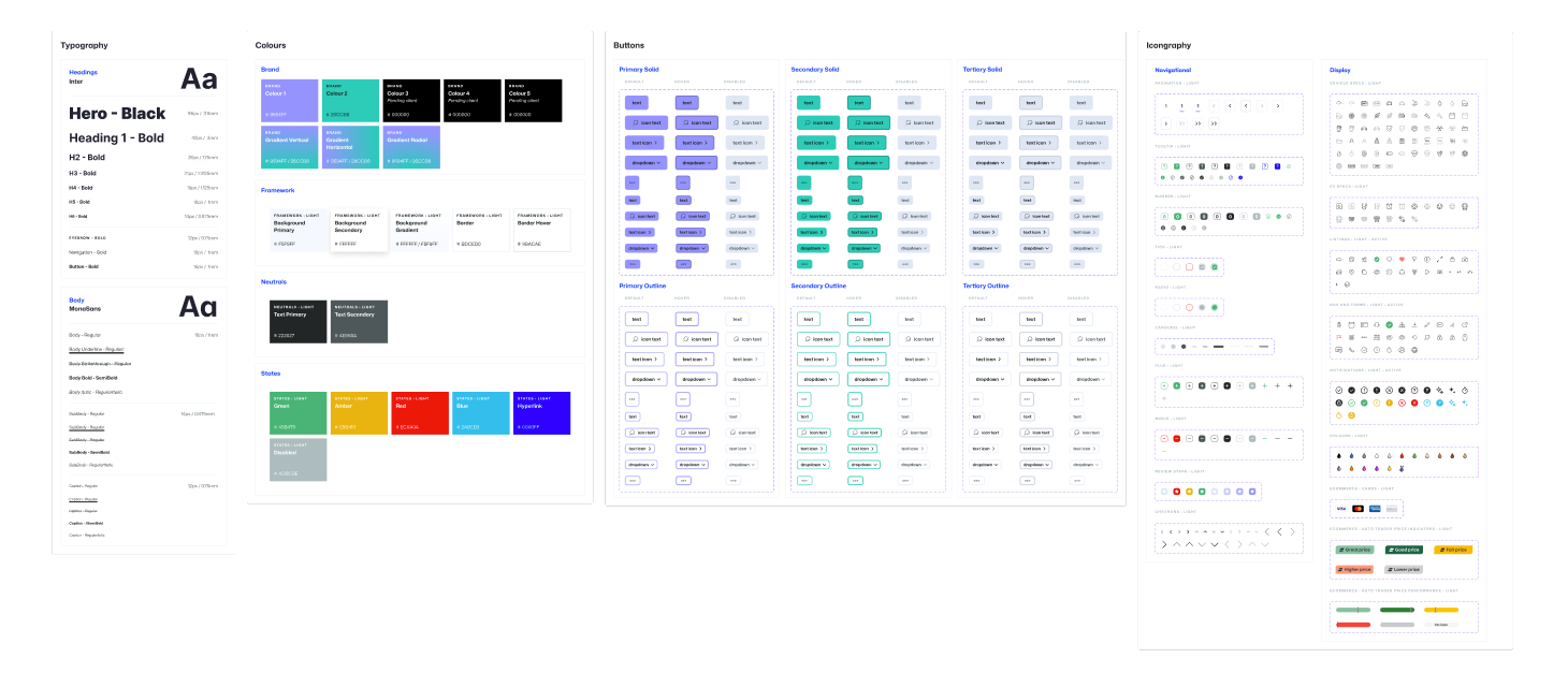
ATOMIC DESIGN
Framework / Scale
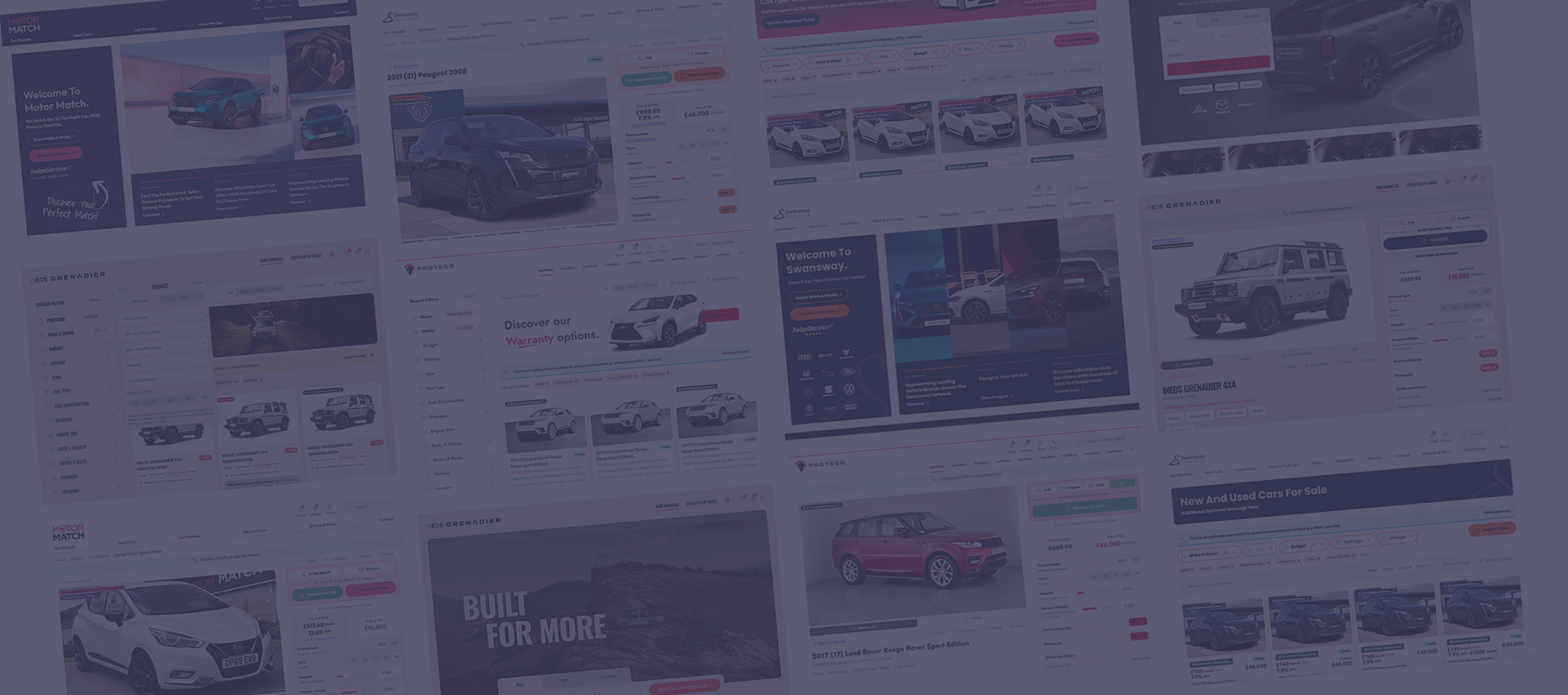
The design system became a comprehensive library, supporting consistent design and development across multiple websites. It allowed rapid builds while maintaining quality, providing a flexible foundation for client branding.
900
Organisms
175
Templates
2,350
Molecules
3,200
Atoms
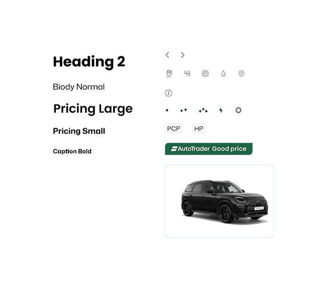
Atoms - Smallest reusable elements like buttons, icons, and form fields.
Molecules - Combinations of atoms forming functional components.
Organisms - Larger sections made from multiple molecules
Templates - Full-page layouts ready for deployment.
Results
& Impact
The design system significantly improved our workflow and client outcomes.
3 hours
Average time to design a new website. Previously weeks; which now allows time to focus on refining components.
5 days
The average time to develop a site. (A huge reduction from months, thanks to reusable components.)
18x capacity
Our ability to onboard new projects increased dramatically. (Enabled more work while maintaining quality and consistency.)
"Increasing our capacity by 18× meant we could take on many more client projects while maintaining the quality and consistency of our work."
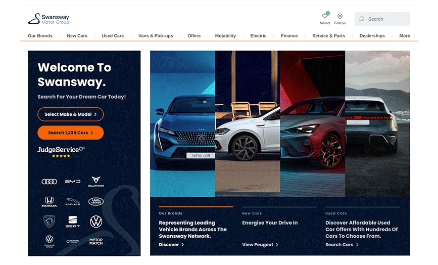
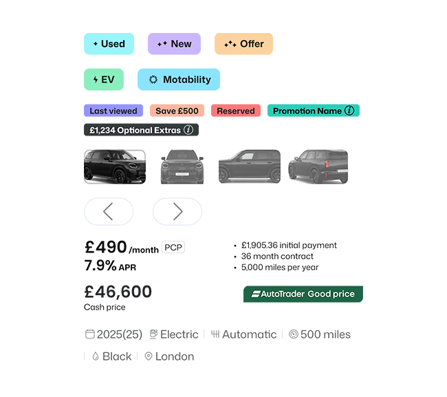
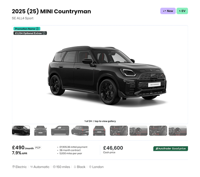
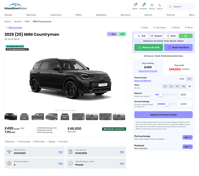
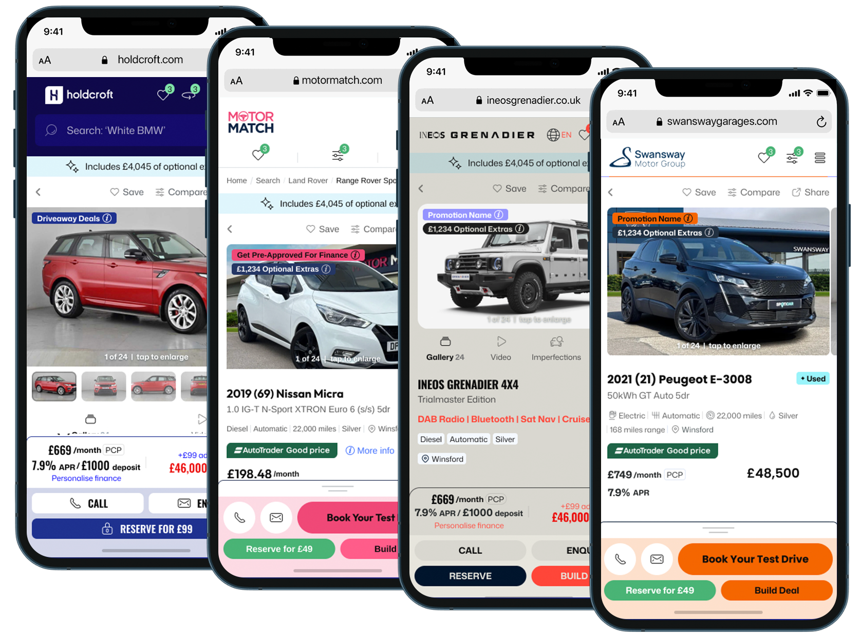
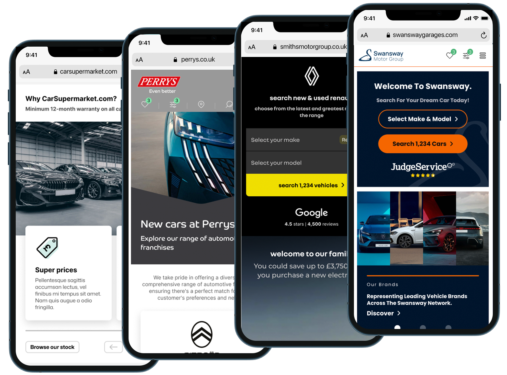
An Automotive Design System
Introducing
ATOMIC DESIGN
Component Library & Rebranding
Reusable components allowed the fast development of websites while applying client-specific branding. By dropping in pre-built components and adjusting styles, we maintained consistency and speed without compromising quality.
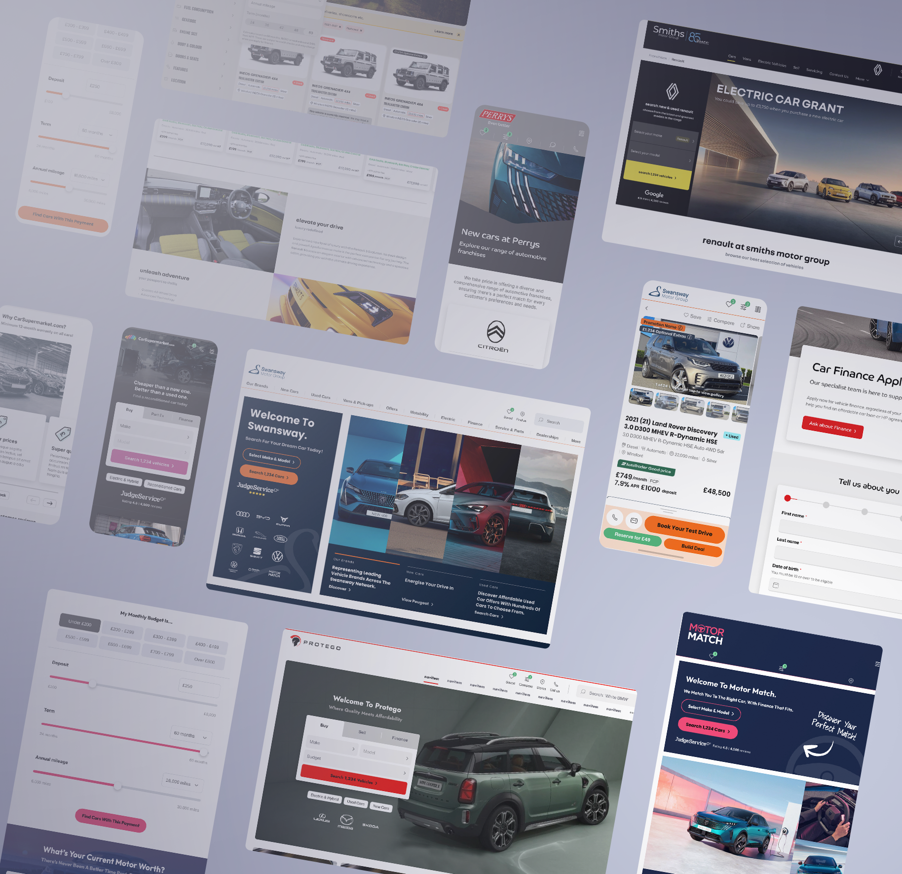
ATOMIC DESIGN
Component Variants for Flexible Solutions
Components with multiple variants offered alternative layouts or functionality for the same element. This flexibility allowed us to configure websites to each client’s specific needs while preserving the core design system.
"A design system only works when the whole team understands and aligns with it — following shared processes and maintaining it together ensures consistency and quality across every project."
Using Data to Turn Insights into Impact
RESEARCH & DATA
Lead Generation 2021-23
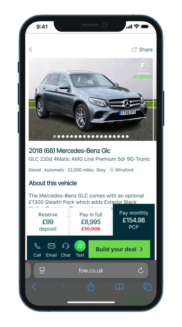
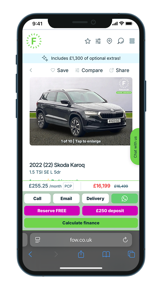
The Dealstacker component streamlined finance, part-exchange, and purchase journeys, improving lead generation. Combining multiple steps into a single, reusable module enhanced conversion and created a seamless experience across websites.
Decisions for improvements were initially guided by user research and later reinforced by data.
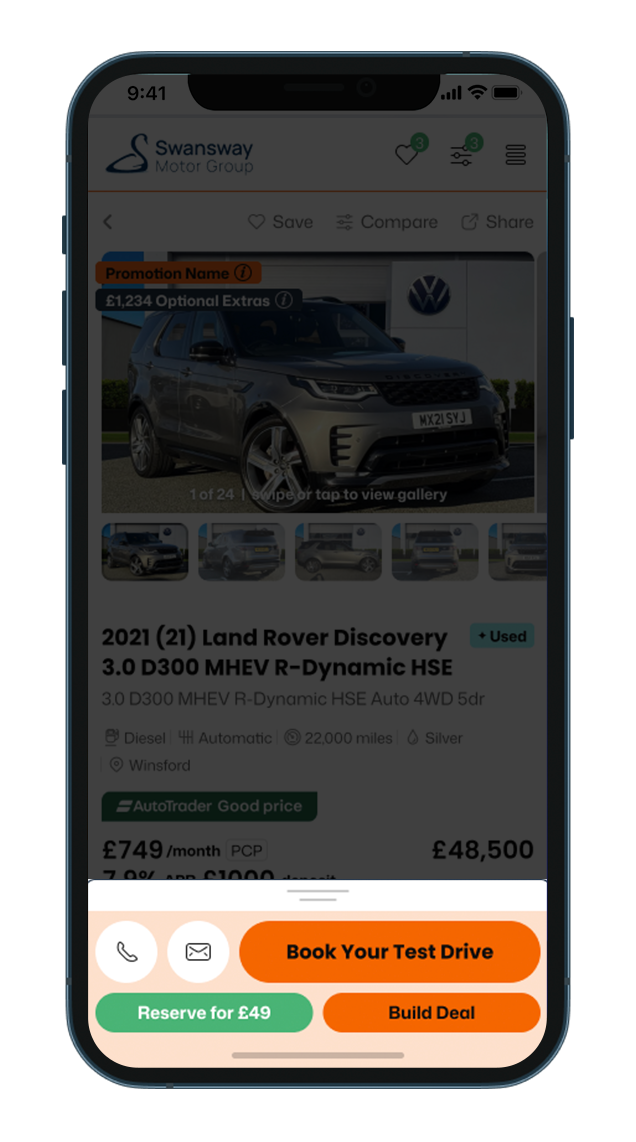
DSv1 2021
Before Interaction
A more structured layout, with clearer prioritisation of key actions based on user feedback. This version provided greater definition and resulted in a higher conversion rate of enquiries.
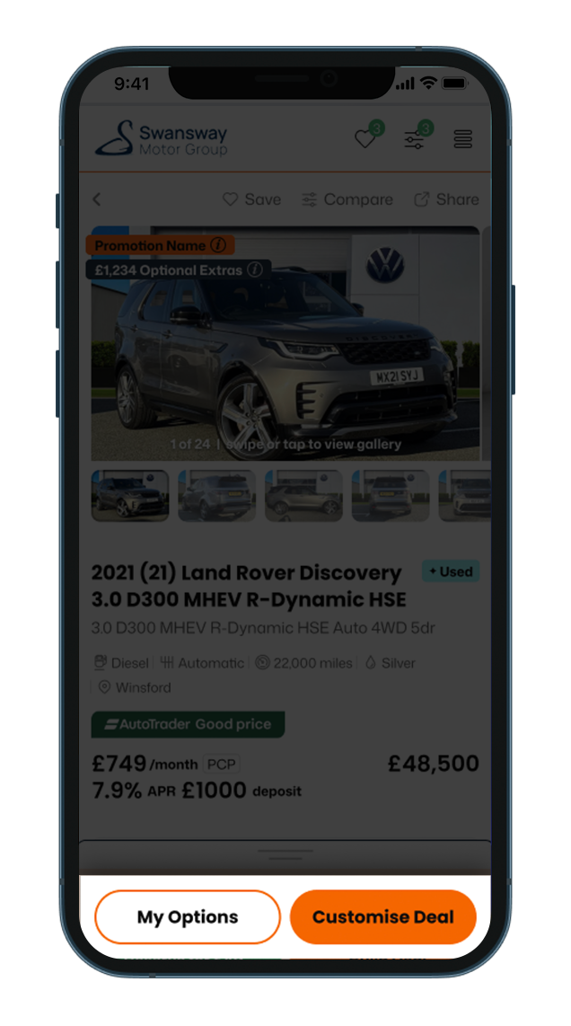
DSv2 2022/23 Closed
Before Interaction
Displays a cluttered, cognitively demanding layout where the hierarchy of choices was later found to be unclear.
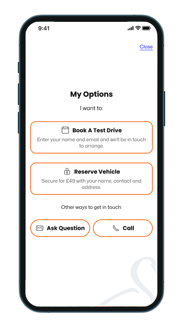
DSv2 2022/23 Open
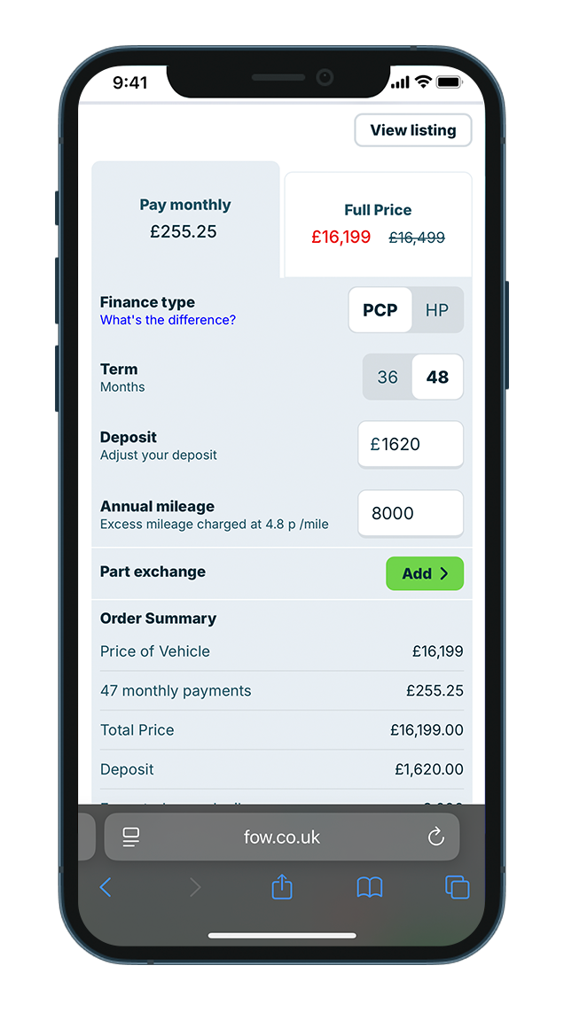
Build Your Deal View
The deal calculator presents a full-screen view, but the relevant information could be displayed more effectively.
RESEARCH & DATA
Refinement 2024-25
Client requested CTAs were displayed for launch but data revealed that some were unnecessarily prominent.
A/B testing showed that simplifying the layout and focusing on core actions improved performance, reducing cognitive load led to higher Test Drive and Reserve conversions.
Even after hiding these already strong CTAs, their conversion rates remained stable.
The deal calculator remains the highest performing ‘Customise Deal’ CTA.
DSv3 2024
Before Interaction
Displays CTAs requested by the client. Positioned to show some hierarchy but reviewing data questioned the important of some being so available.
DSv3 2025 Closed
Before Interaction
A/B testing found this variant to be just as effective. With less for the user to cognitively process, it resulted in an increase in Test Drive and Reserve conversions.
DSv3 2025 Open
After Interaction
Hiding already high-performing Test Drive and Reserve CTAs was a gamble however their conversion rates remained strong.
RESEARCH & DATA
Using GTM and Analytics to Drive Informed Decisions
Using Google Tag Manager, we implemented custom event tracking on all Dealstacker buttons. These events captured user interactions in real time without requiring code changes.
The data was then monitored in Google Analytics, allowing us to identify which CTAs attracted the most engagement and where users dropped off. This insight helped validate design decisions and guided further optimisation of button hierarchy and placement.
Conversion Event Counts:
Build Deal = 998 (72.05%)
Test Drive = 143 (10.31%)
Reserve = 129 (9.32%)
Contact = 68 (4.88%)
Phone Call = 34 (2.44%)
NOTES
Future Plans
This project could not have been achieved alone. In 2019, my team didn’t have a design system and work was bespoke for each project. With support from colleagues, developers, QA testers, and product owners, we gradually built a shared system that now sets a baseline for all projects.
This experience reinforced the value of collaboration, iteration, and scalable foundations. It showed how a design system can improve efficiency, maintain consistency, and give the team space to evolve and learn continuously.