Rethinking a Nursery App Experience
My Role: Designer, Researcher
Team: Self (Personal Case Study)
Duration: 3 weeks (30 hours)
01 The Brief
02 Empatise
03 Define
04 Ideation
05 Design
06 Branding
07 Results
Problem
As a parent and regular user of a nursery app, I found that the one I was using fell short of what I expected and didn’t offer a holistic or easily navigable experience.
The app is split into two main sections: a single feed for child, nursery, and teacher updates, and a settings area. While functional, the current setup feels limiting.
The feed is overwhelming at times, showing all updates in one stream, making it difficult to focus on the most important or relevant information at any given moment.
Solution
To design an app that improves upon this experience, one that is more engaging, informative, and user-friendly based on parent and nursery experience.
My goal is to create an app that provides a richer experience with more detailed updates and breaks down content into smaller, more digestible chunks.
By presenting information in a clearer, segmented way, parents will be able to quickly find what’s most relevant to them and their child’s development, while also feeling more connected to the nursery and teachers.
EMPATHISE
Secondary Research & Assumptions
To guide the design of the nursery app, I carried out secondary research and drew on my own experiences as a parent using similar platforms. I reviewed competitor apps, app store feedback, and parent forums to identify common frustrations. Although I didn’t run interviews or surveys for this conceptual project, I based user assumptions on real-world patterns supported by publicly available parent feedback.
Existing App: Tapestry
Limited App Functionality: Some features, such as the care diary, are only accessible via the website, not the app.
App Usability Issues: Users have reported that recent updates have made the app less user-friendly, such as the removal of the notifications section and the requirement to log in every time the app is used.
Existing App: FamIly
Notification Overload: The app sends the same type of notification for both minor updates and critical alerts, making it difficult for users to distinguish the importance of messages.
Inadequate Messaging Features: Some users find the messaging system confusing, particularly distinguishing between messages sent to individual teachers versus the entire class.
Existing App: Blossom
Feature Limitations: The self check-in, function, have been highlighted as needing improvement.
Notable Pain Points
Overwhelming, Unfiltered Feeds
Parents often found single-stream update feeds too busy, making it hard to spot important updates like meals, naps, or direct messages.
Lack of Clarity and Structure
Information was rarely grouped by type (e.g., care routines, learning, events), leading to confusion or missed updates.
Missed Opportunities for Connection
Parents wanted more meaningful insights into their child’s learning and care—not just one-liners, but context and personality.
Conclusion on Empathise Phase
Through secondary research and competitor analysis, I identified key pain points in existing nursery apps. They reinforced the need for a fully functional, app-first experience that’s simple, reliable, and parent-friendly. Usability issues, confusing messaging, notification overload, and limited features reinforced the importance of clear communication, streamlined admin tools, and easy access to daily updates—all within a single, intuitive app.
“Designing with parents in mind, who want regular, reassuring updates about their child’s day, but have limited time to check in due to work or other responsibilities.”
DEFINE
What I’ll Do Differently
Rather than reinventing the wheel, I’ll focus on enhancing the existing foundation with familiar, proven features that best serve our target audience.
Minimum functionality
Real-time alerts
Daily log of activity, text, image or video
Direct messaging between parents and nursery staff
Group messages or announcements from the nursery
Additional Functionality
An always present app menu, allowing parents to navigate between the core sections of the app with a single select
Self check experience countering any requirements to log in every time the app is used
Let parents adjust privacy and consent settings
Options to update child details directly (e.g. dietary needs, routine and habits)
Improved UX/UI Opportunities
A welcome screen showing snippets of key information allowing parents to view updates by category
Break updates into sections: Activity, Care, Learning
A new boards dedicated to nursery communications to all, separated from the individual daily child activity feed
More digestible notifications feed making it obvious whats been seen, what is new, with date and time stamps
IDEATION
User Flow
Once the key features for the nursery app were finalised—such as daily updates, care tracking, and parent notifications, the next step was to bring them together into a cohesive and intuitive experience for parents.
To do this, I began by creating a user flowchart that mapped out all the main screens of the app and how they connect, helping to visualise how parents would navigate through the app day-to-day.

A full user flow mapping every possible journey from the entry screen downward, establishing the app’s information architecture and primary user pathways.
IDEATION
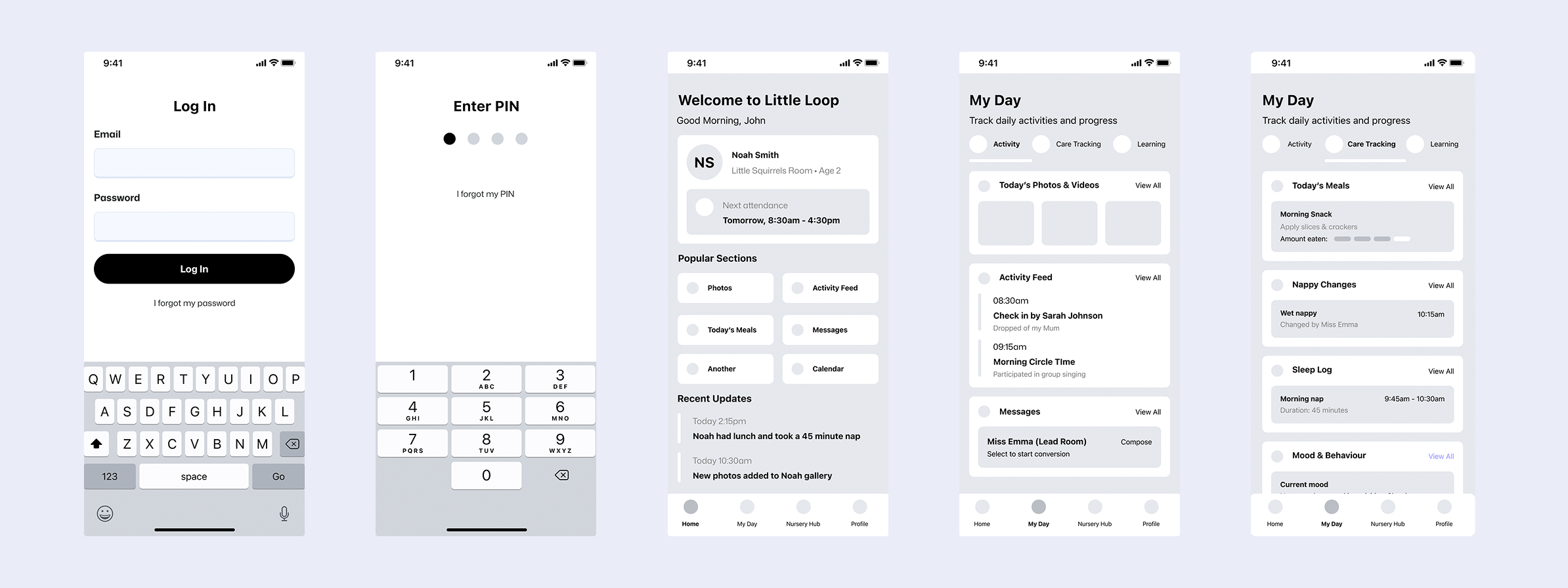
From Flow to Function with Wireframes
After completing the first iteration of the user flow for the nursery app, I moved on to exploring the experience on a screen-by-screen level using wireframes. I already had a strong vision for how the app should be clear, reassuring, and parent-friendly so I chose to develop more detailed wireframes to bring that vision to life early in the design process.

“A self-initiated nursery support app, inspired by my own experiences as a parent and designed as a thoughtful, user-centred alternative to existing solutions."
DESIGN
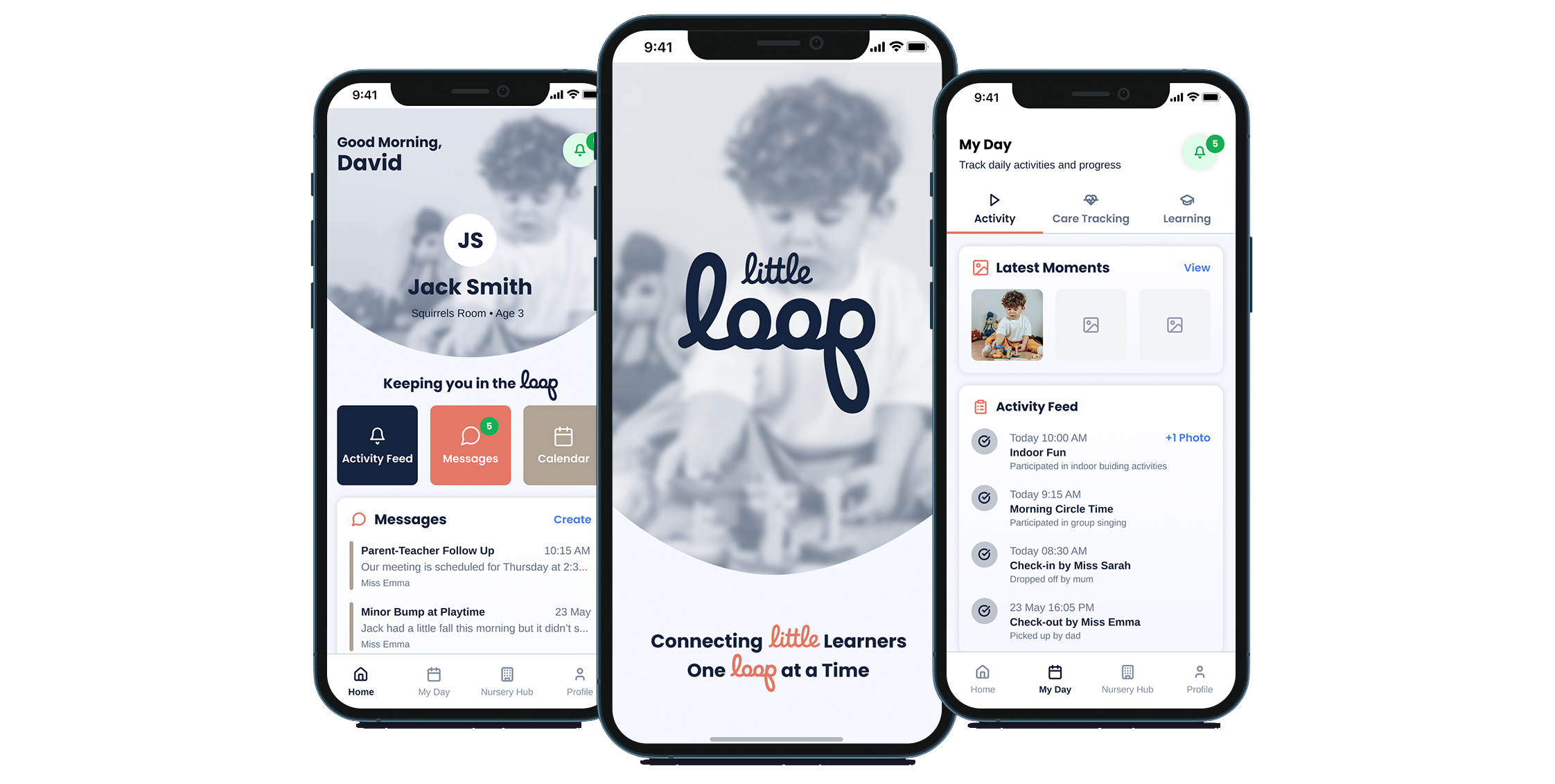
Introducing the Little Loop app
All the insights gathered from usability testing were applied to refine the first version of the nursery app, ensuring it launched with a strong foundation in usability and parent-friendly design.

Welcome screen with short pause before animation into the sign in screen.
A welcome back sign screen for returning users who have visited before. Alternative screen for first time users would be in addition.
A central space for notifications across features, plus a private parent-nursery message board.
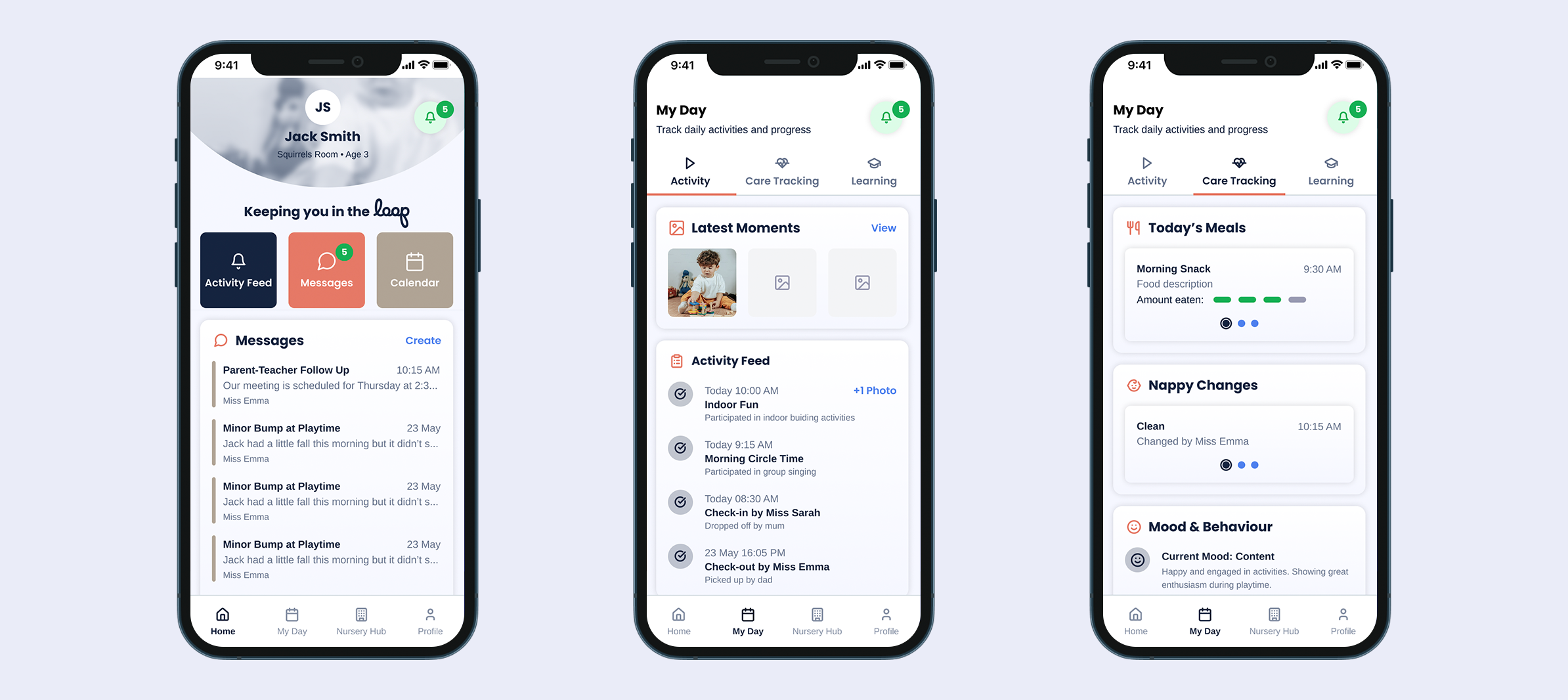
A home screen with scroll-based animations that reduce the profile area, plus soft animations throughout the app.
The activity feed, Translating scattered, overwhelming update feeds into structured, digestible segments.
A care overview that replaces end-of-day printouts and manual event tracking.
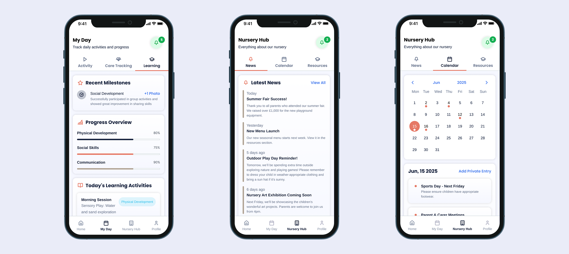
Milestones presented visually with infographics and icons, rather than plain text.
A dedicated space for the nursery to share updates and events.
A shared calendar for nursery events—plus a private space for parents to add their own.

Reduce duplication of admin tasks per parent with this one home for all resources.
Child preferences allow parents to share key information which the nursery can refer too.
Parent preferences allows parents to manage and edit preferences anytime.
Clear Updates at a Glance
Many nursery apps mix updates into a single feed, making it hard to see what’s new. I created a home section that highlights important changes since your last visit, giving a personalised snapshot with quick links to key areas.

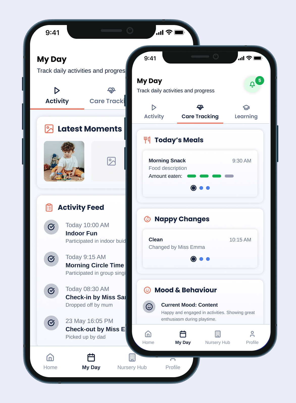
My Day
The ‘My Day’ area provides a clear snapshot of your child’s daily activities, covering the past 7 days. A dedicated ‘Latest Moments’ section highlights photos and videos as they happen. Unlike traditional end-of-day summaries, this app logs meals, nappies, mood and behaviour in real time, giving a fuller, more accurate picture throughout the day.
Nursery Hub
The ‘Nursery Hub’ lets nurseries share important updates directly in the app, replacing the reception noticeboard. It includes a calendar for events and deadlines, and parents can add private entries to stay organised with reminders that matter to their family.

BRANDING
Creating a Brand
The Little Loop logo uses flowing, looping text to symbolise continuous connection between parents, children, and teachers. The seamless, joined design reflects the app’s mission: to keep everyone in the loop sharing care, moments, and milestones throughout the nursery journey. The gentle curves suggest nurturing, inclusivity, and an ongoing relationship, creating a warm, welcoming identity for the app.
The Little Loop colour palette combines navy blue, pastel reds, warm browns, and soft greys to create a sense of warmth, trust, and calm.
Logo
App Logo

Colour Palette
RESULTS
Adoption Metrics (Projected)
These figures are directional rather than definitive, intended to illustrate the likely scale of improvement if the redesigned experience were implemented.
20–30%
Higher App Daily Active Usage
Clearer categorisation and an always-present menu would likely increase daily log-ins by 20–30%, as parents can quickly access what matters to them.
35–45%
Improved Notification Engagement
Breaking updates into Activity, Care, and Learning could improve notification open rates by 35–45% due to reduced noise and better relevance.
25–40%
Reduced Parent–Nursery Admin Time
Features like direct messaging, update segmentation, and self-check could reduce back-and-forth admin by 25–40%.
10-20 points
Stronger Parent Satisfaction
A cleaner, more meaningful update experience is expected to increase parent satisfaction scores (CSAT/NPS) by 10–20 points based on patterns seen in competitor reviews.
RESULTS
Reflections
Working through a conceptual project reinforced how valuable secondary research can be when primary research isn’t possible. Reviews, forums, and competitor analysis revealed consistent pain points around clarity, structure, and connection, which guided the design direction more than expected.
Key Takeaways
A structured, segmented information model dramatically improves clarity and reduces parent overwhelm.
Familiar mobile patterns make the app immediately usable without requiring onboarding.
Parents value depth and context in updates, not just volume.
An always-visible navigation system increases confidence and reduces cognitive load.
Even without primary research, secondary insights can meaningfully shape a user-centred product direction.