
Dashboard Solution, Designed with AI
My Role: Product Designer
Duration: 2 days
01 Overview
02 Define
03 UI Design
04 Prototyping
05 Reflections
“I explored how AI could accelerate the design of an operational dashboard experience while maintaining human-led product thinking, UX judgement and design system discipline.”
THE CHALLENGE
Making operational data easier to understand and act on
Operational teams rely on dashboards to monitor performance, spot issues and understand what is happening across their sites. The challenge wasn't simply presenting more data, it was making that information clear, prioritised and actionable.
For FlowOps, I explored how a dashboard experience could help different users quickly understand:
What needs attention?
Where is the problem?
Why is it happening?
What can I do about it?
The experience needed to support two perspectives:
Operations Managers - monitoring their site, investigating issues and taking action.
Regional Directors - comparing sites, spotting patterns and understanding where attention may be needed.
Rather than designing disconnected dashboard screens, I focused on creating a connected experience that could move a user from:
Signal → Cause → Action
01: Command Centre
Get an overview of operational health and quickly identify what needs attention.
02: Sites
Drill into a site to understand where issues are occurring and investigate further.
The aim was to make the dashboard more than a collection of metrics, it needed to help users understand what was happening and decide what to do next.
03: Performance
Explore trends and performance data to understand patterns over time.
MY APPROACH
AI-accelerated, human-directed design
I used Claude to accelerate exploration and UI development, while keeping the core product and UX decisions human-led, helping me rapidly explore product ideas, interface approaches and alternative solutions.
Rather than starting with UI generation, I first established the product concept, users, goals and information hierarchy. From there, AI was used to generate and compare options that I could critique, challenge and refine.
1
Define
Product, users & goals
2
Explore
Generate options with AI
3
Evaluate
Apply UX & product judgement
4
Refine
Challenge & iterate
5
Systemise
Create reusable patterns
The goal wasn't to remove design work, it was to reduce the time between idea, evaluation and iteration.
MY APPROACH
From Insight to Action
A dashboard can surface a problem without helping the user resolve it. I wanted FlowOps to support the full investigation journey — from recognising that something needs attention to understanding the cause and taking action.
The core experience was structured around three stages:
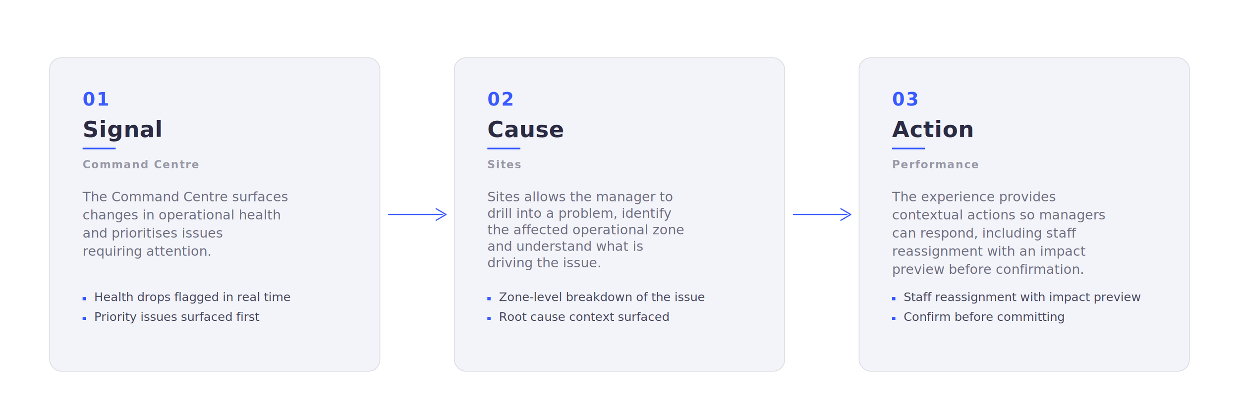
Design principle: Every critical signal should provide a path towards understanding its cause and, where appropriate, taking action.
KEY DECISIONS
Decisions that Shaped the Experience
AI made it possible to explore alternatives quickly, but generating options wasn't the difficult part. The important work was evaluating those options against user goals, identifying where they failed, and deciding what should change.
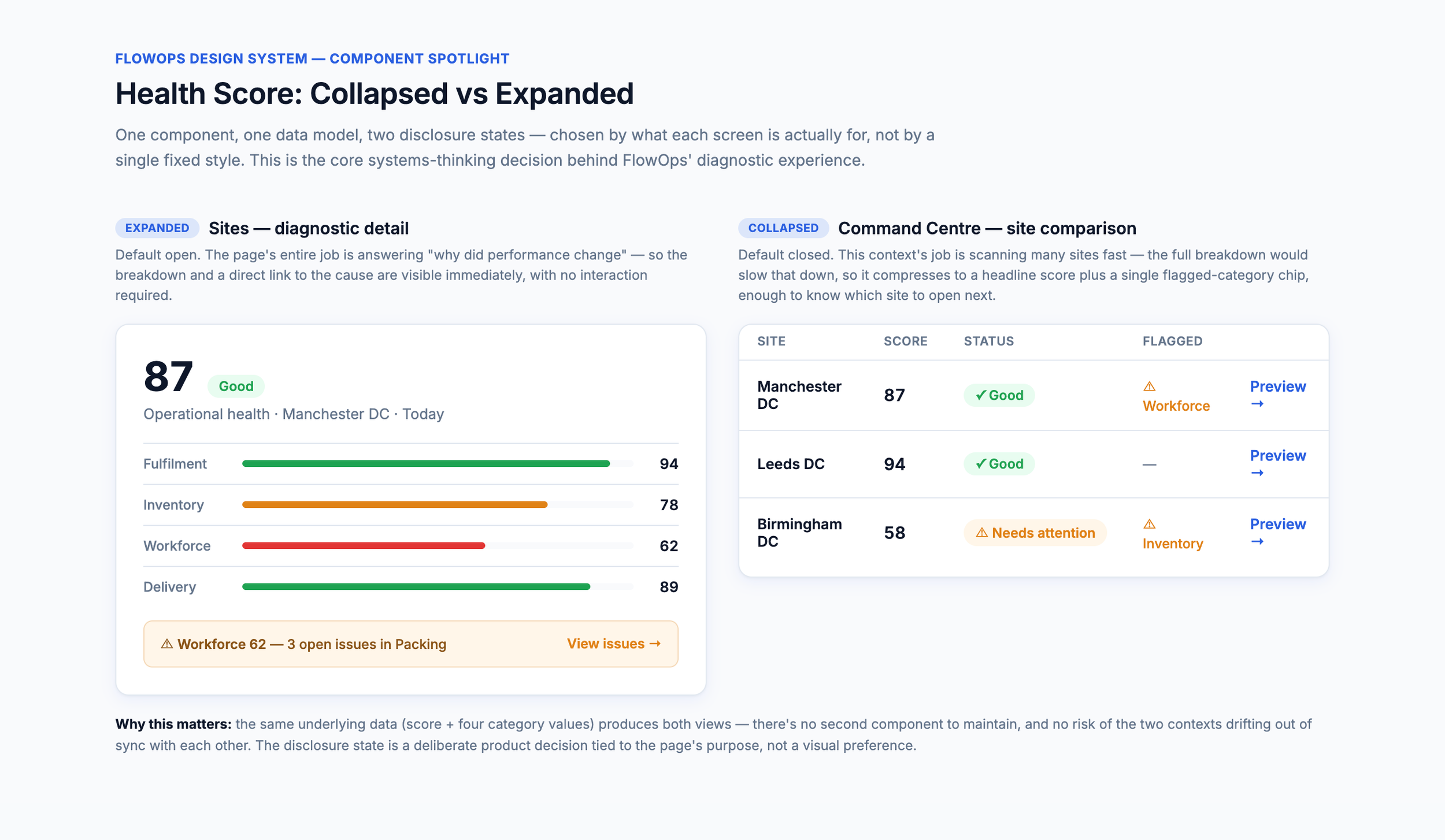
1. Making the Health Score Explainable
The Problem
The Health Score needed to provide a quick operational signal without becoming a black-box metric.
The Decision
Rather than treating it as one fixed component, I developed it as a progressive disclosure pattern. It remains compact where users are scanning performance, but expands on diagnostic screens to reveal the factors contributing to the score.
Why It Mattered
One data model could now support two different user needs: scan quickly or understand why.
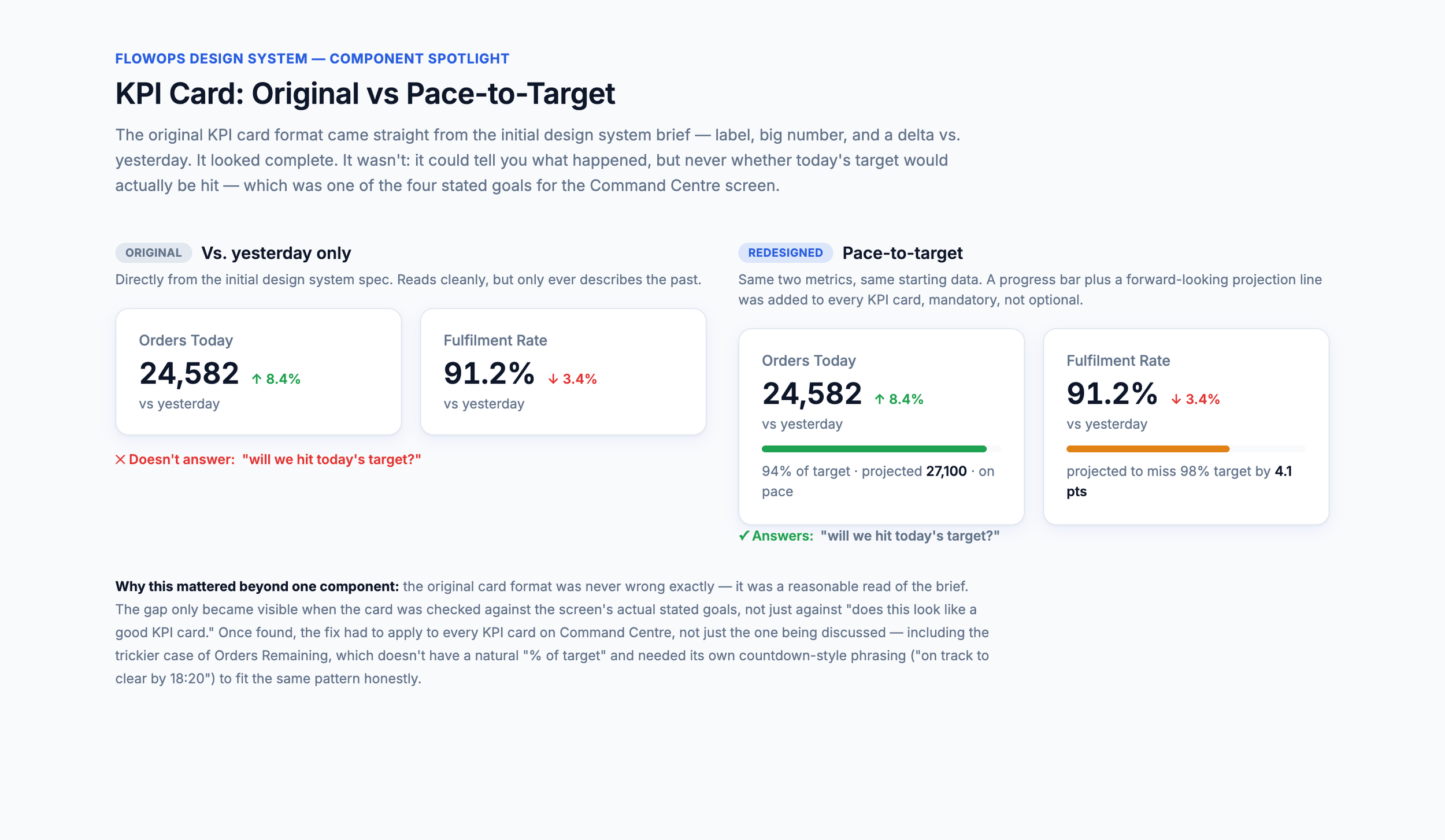
2: Designing KPIs around the decision
Problem
The original KPI cards compared performance with yesterday. Useful information, but it didn't answer the more important operational question: “Are we on track to hit today's target?”
Decision
The cards evolved to prioritise pace-to-target, giving managers context around where performance is heading rather than simply reporting what has already happened.
Why it mattered
The metric became decision-support rather than reporting.
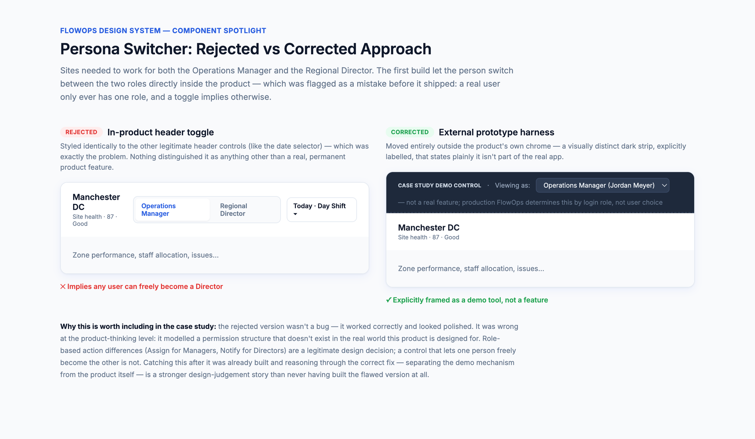
3: Correcting unrealistic role behaviour
Problem
During exploration, AI introduced an in-product control allowing users to switch between Operations Manager and Regional Director views.
I recognised the flaw: real users wouldn't choose their permissions or role inside the product.
Decision
Role-specific experiences remained, but the switch was removed from the product and moved into an external case-study prototype control. In production, FlowOps would determine the experience from the authenticated user's role. Your final prototype explicitly documents this distinction.
Why it mattered
Fast generation still requires product judgement. A technically functional interaction isn't necessarily a credible product interaction.