
Designing a Clear, Low-Risk Flow for Logging Off-the-Job (OTJ) Hours
My Role: Designer, Researcher
Team: Design
Duration: 2 days
01 Overview
02 Define
03 UI Design
04 Prototyping
05 Reflections
Overview
Context, Design Approach
OVERVIEW
Logging Off-the-Job
This case study explores how learners can confidently log their Off-the-Job (OTJ) training hours in a way that is clear, structured and suitable for review or audit.
I was asked to produce a low-fidelity UX design (sketches, wireframes, or a simple prototype) to demonstrate:
The user flow and structure
Key assumptions and decision-making
How learners enter OTJ hours accurately and consistently
A working prototype was created using AI (Lovable) to demonstrate the interaction in practice.
The Problem
Logging OTJ hours is a high-risk, low-confidence task for learners.
Users may not fully understand:
What counts as valid OTJ activity
How much detail is required
Whether they are entering information correctly
At the same time, the data may be reviewed or audited, meaning accuracy is more important than speed.
This creates a core tension between:
Fast completion
Clear guidance and error prevention
Design Approach
I designed the experience around a simple principle:
The user’s main question is not “how do I complete this?”, but “am I doing this correctly?”
This shifted the focus from efficiency to confidence, structure, and error prevention.
To support this, I designed a five-step flow that progressively reduces uncertainty.
Define
Process Flow, Key Decisions
DEFINE
Defining The Flow
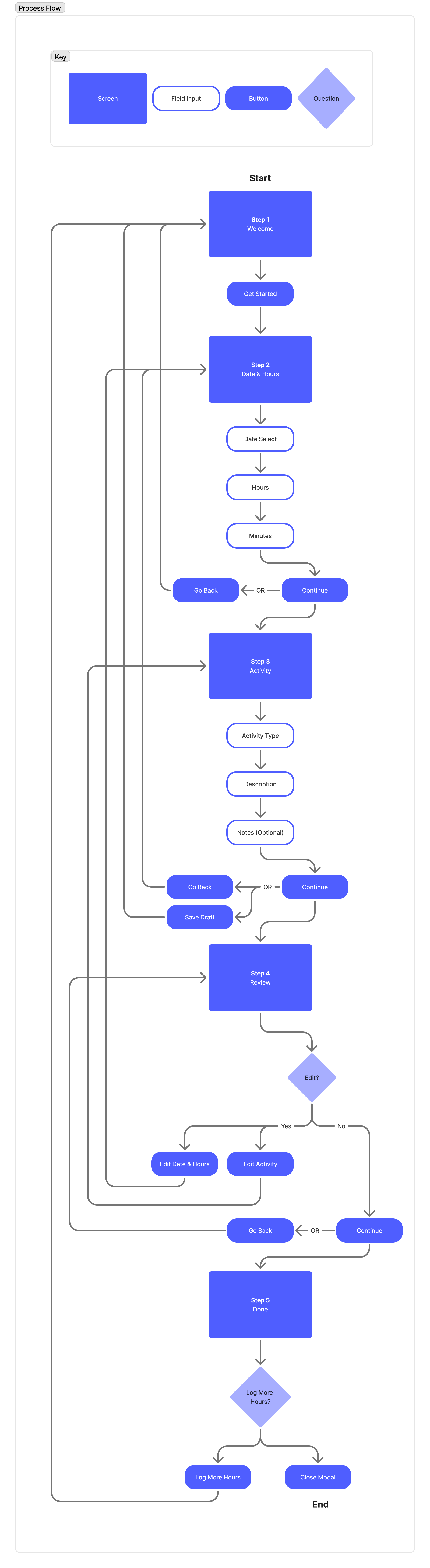
Before designing screens, I mapped the end-to-end experience in FigJam to understand where users are most likely to make mistakes or feel uncertain.
This stage focused on turning an unclear task into a structured journey.
Key decisions included:
Breaking the task into multiple steps rather than a single form
Introducing guidance before data entry
Designing for error prevention rather than correction
Ensuring each step reduces uncertainty progressively
The highest risk moments were:
Defining what counts as OTJ work
Selecting the correct activity type
Ensuring accurate date/time entry
UI Design
Wireframes, UI Design
UI DESIGN
Wireframes
This is where the flow was translated into interface design.
The goal was to turn structure into clear, low-friction UI patterns while maintaining accuracy and audit readiness.
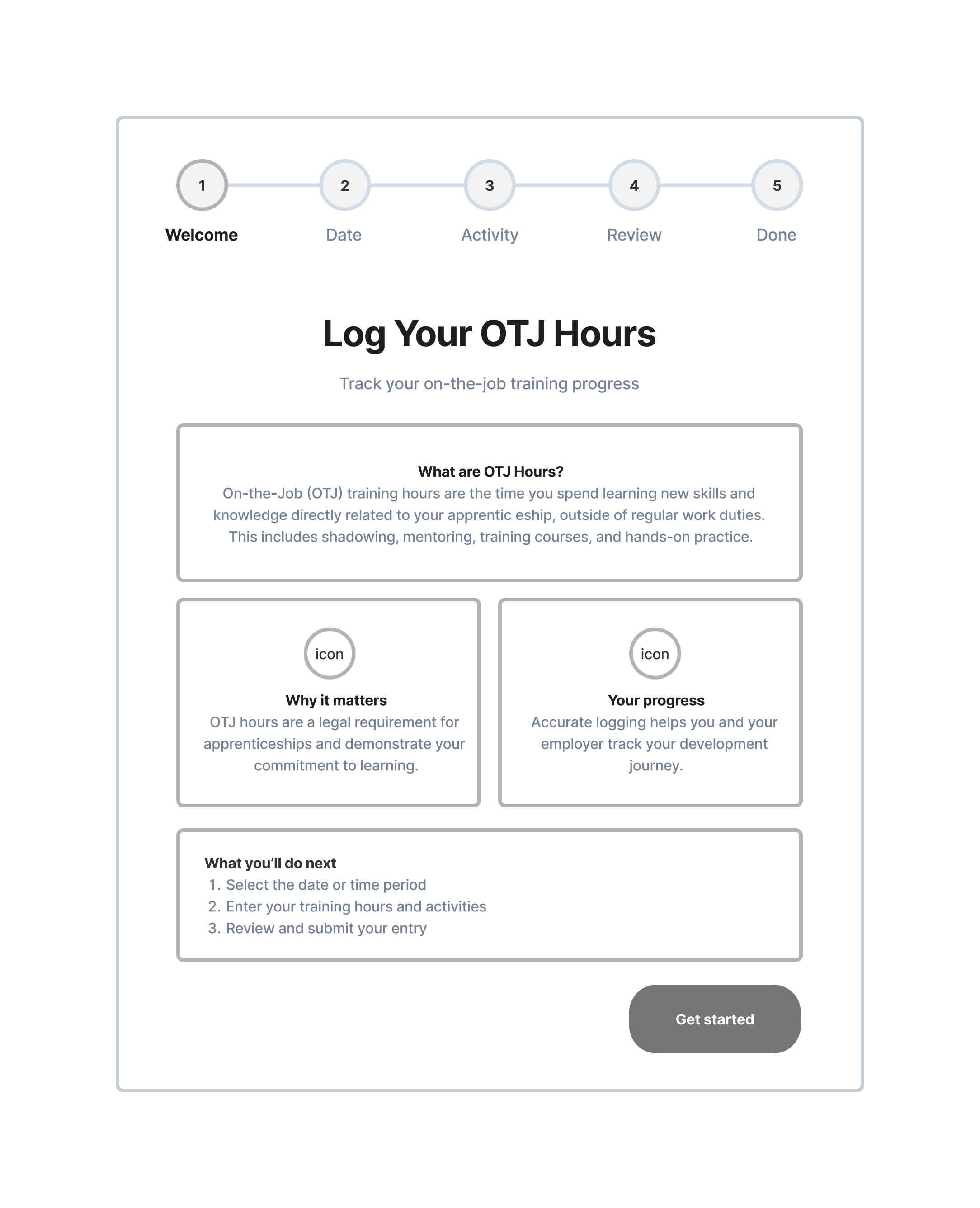
Step 1: Context & Guidance
Explains what OTJ hours are
Sets expectations before data entry
Reduces uncertainty and anxiety
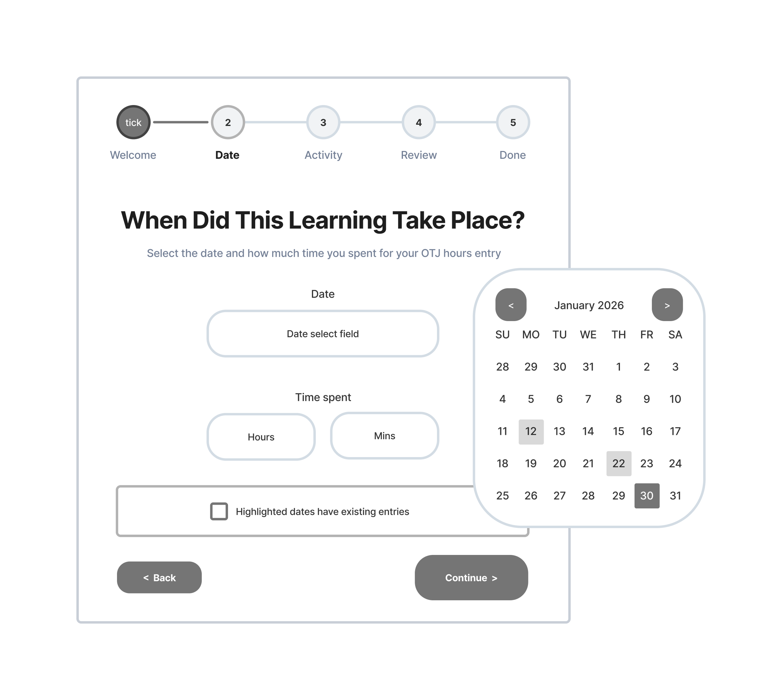
Step 2: Date & Time
Structured date picker
Hours and minutes fields (not free text)
Visual indication of existing logged entries
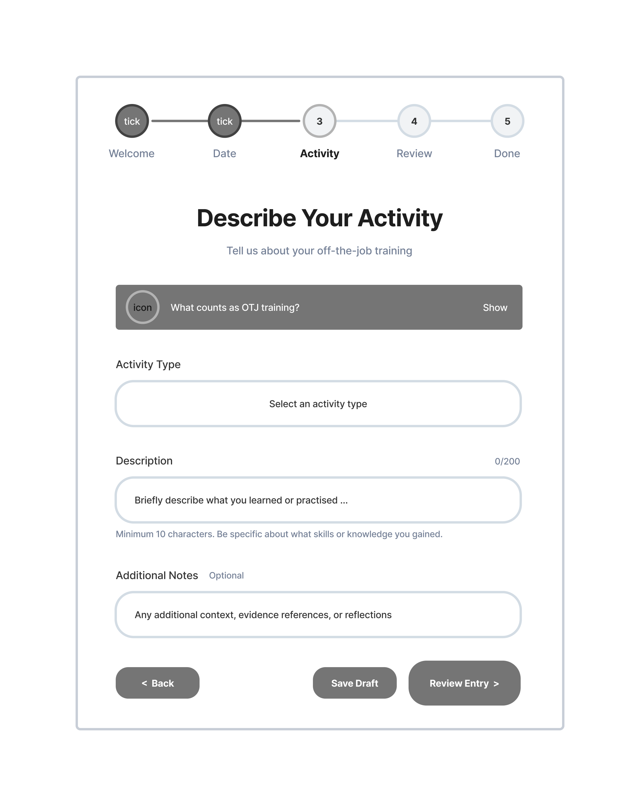
Step 3: Activity Selection
Predefined OTJ activity types
Supporting examples of valid activities
Optional description field
Save as draft option
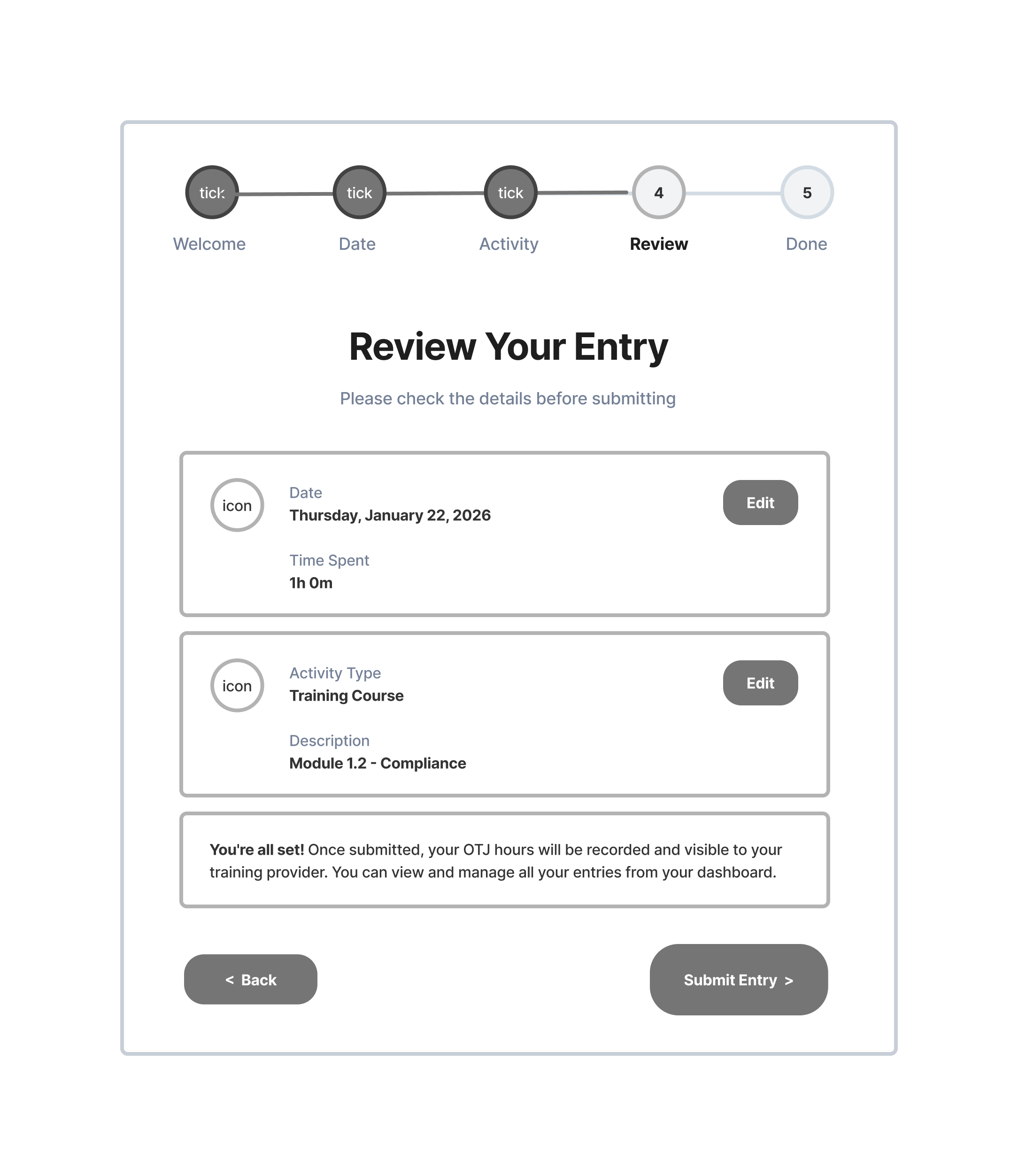
Step 4: Review
Full summary of entered date
Inline edit options
Final validation checkpoint
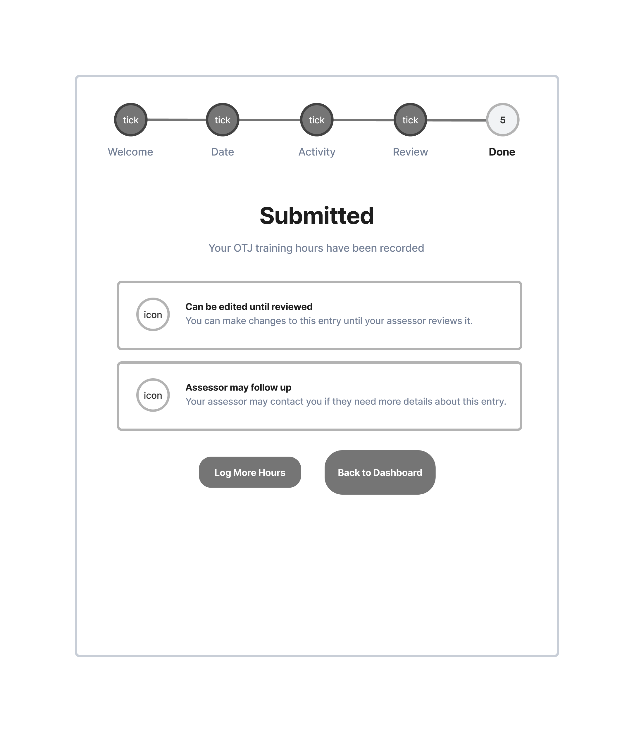
Step 5: Submission
Confirmation of submission
Status tracking (e.g. pending review)
Ability to edit before assessor review
Prototyping
Validation, Testing
PROTOTYPING
Rapid Prototyping
The wireframes were brought to life using an AI-generated prototype (Lovable) to validate the flow end-to-end.
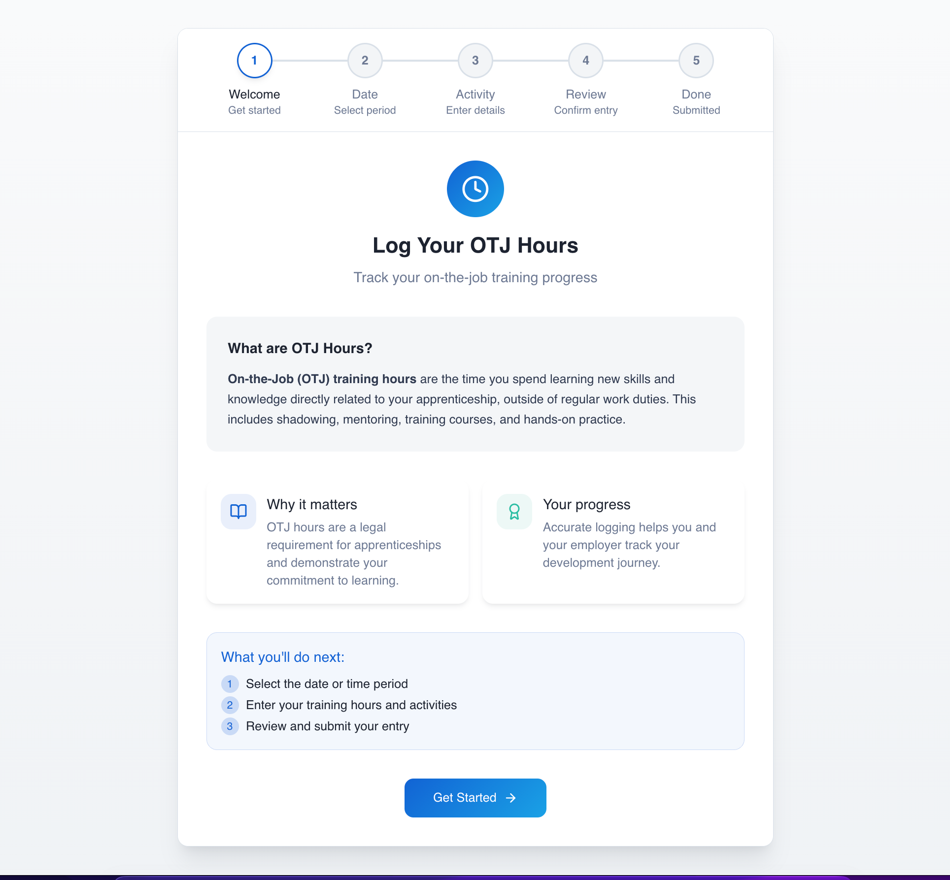
Design intent: Help users feel confident before they begin inputting data.
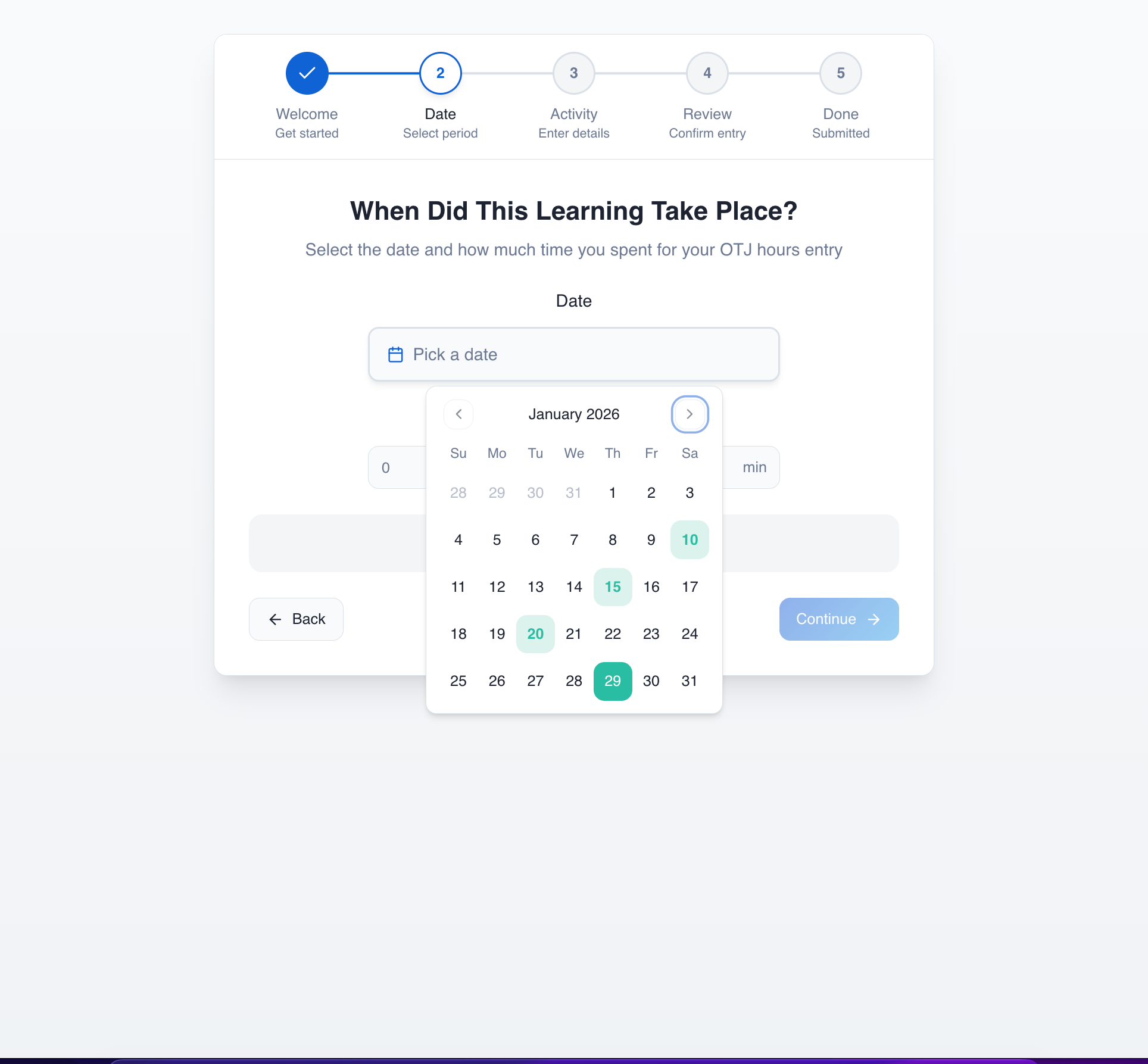
Design intent: Prevent format errors and duplicate logging before they happen.
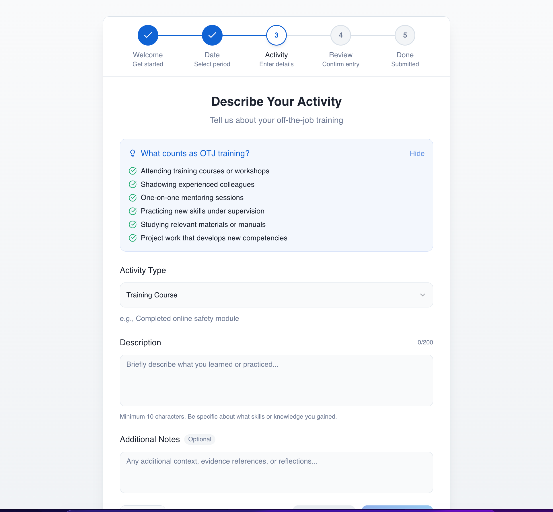
Design intent: Reduce ambiguity around what counts as OTJ learning. This step prioritises clarity over flexibility, ensuring consistency for review or audit.

Design intent: Clearly mark optional areas and to only make progress buttons active once all mandatory detail has been entered.

Design intent: Give users a moment of reassurance and error correction before submission. This step is important for confidence, especially in a compliance-driven flow.
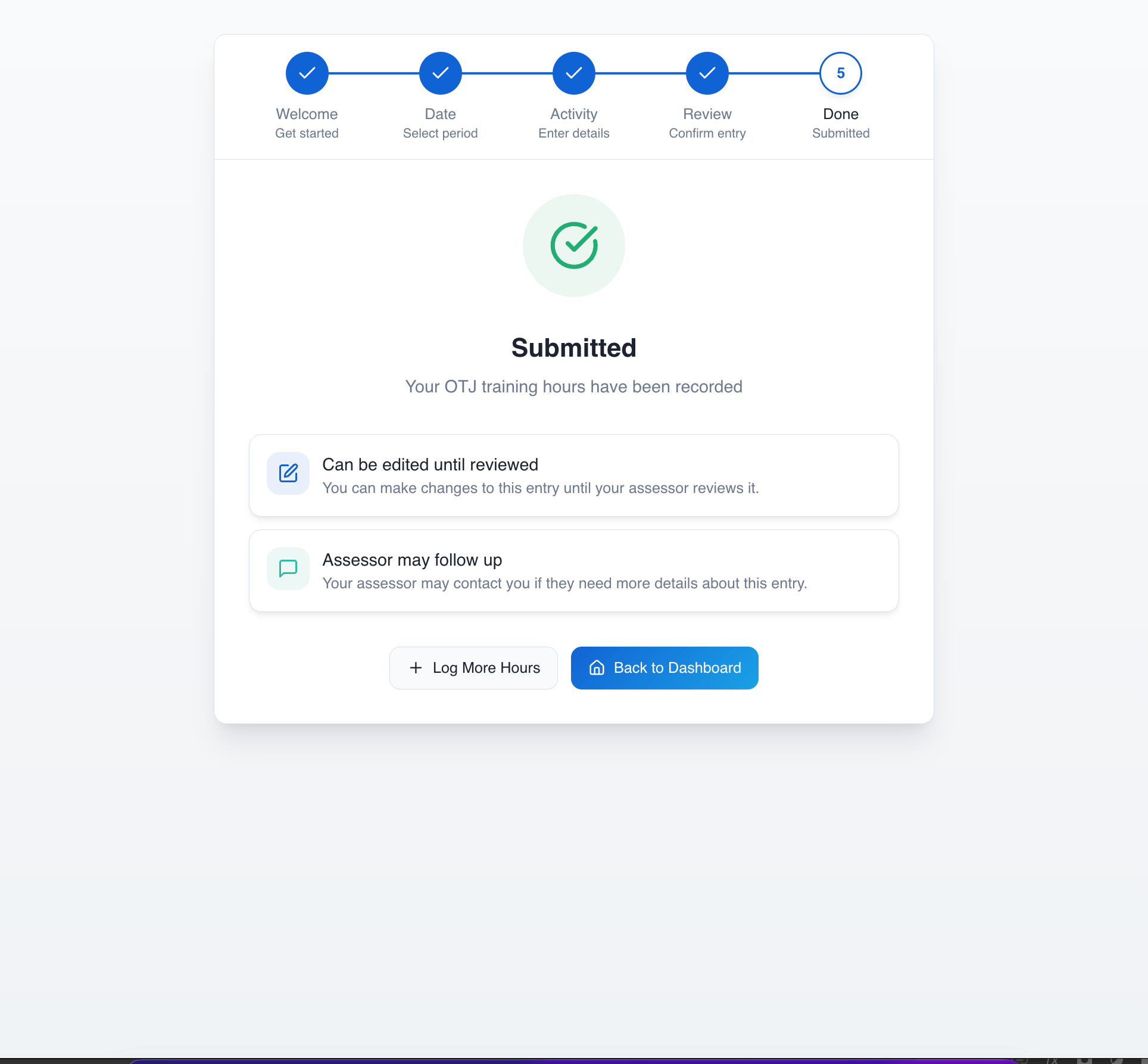
Design intent: Reflect real-world workflows where entries may be reviewed or corrected later.
Reflection
Trade-offs, improvements, maturity thinking
REFLECTION
Could I Have Reduced The Steps? Yes, and Here’s Why I Didn’t
A more mature version of this experience could:
Reduce the flow to 2–3 steps once users are familiar
Introduce contextual or adaptive guidance
Enable faster “quick logging” for experienced users
Reduce reliance on upfront explanations over time
The current version prioritises first-time user confidence over long-term efficiency.
REFLECTION
Key Trade-offs
Guidance vs speed: More guidance improves accuracy but slows entry.
Structure vs flexibility: Structured inputs improve consistency and auditability but reduce user freedom.
Upfront explanation vs progressive disclosure: Front-loading guidance reduces mistakes but increases initial cognitive load.
Accessibility Considerations
Clear form labels and persistent field context
Structured headings for screen readers
Inline validation with descriptive error messaging
Keyboard navigation support and predictable interactions