
FlowOps
Designing an Operational Dashboard with AI
My Role: Product Designer
Tools: Claude
Duration: 1 day
Focus: AI-Assisted Design, Dashboard, Content Design
01 Challenge
02 Approach
03 Key Decisions
04 Designing with AI
05 Final Concept
“I explored how AI could accelerate the design of an operational dashboard experience while maintaining human-led product thinking and UX judgement.”
THE CHALLENGE
Designing An Operational Dashboard
Operational teams rely on dashboards to monitor performance, spot issues and understand what is happening across their sites. This challenge wasn't simply about presenting more data, it was making that information clear, prioritised and actionable.
For FlowOps, I explored how a dashboard experience could help different users quickly understand:
What needs attention?
Where is the problem?
Why is it happening?
What can I do about it?
The experience needed to support two user perspectives:
Operations Managers - monitoring their site, investigating issues and taking action.
Regional Directors - comparing sites, spotting patterns and understanding where attention may be needed.
MY APPROACH
I used Claude to accelerate exploration and UI development, while keeping the core product and UX decisions human-led, helping me rapidly explore product ideas, interface approaches and alternative solutions.
Rather than starting with UI generation, I first established the product concept, users, goals and information hierarchy. From there, AI was used to generate and compare options that I could critique, challenge and refine.
AI-Accelerated, Human-Led Design
1
Define
Product, users & goals
2
Explore
Generate options with AI
3
Evaluate
Apply UX & product judgement
4
Refine
Challenge & iterate
5
Systemise
Create reusable patterns
“The aim was to make the dashboard more than a collection of metrics, it needed to help users understand what was happening and decide what to do next.”
MY APPROACH
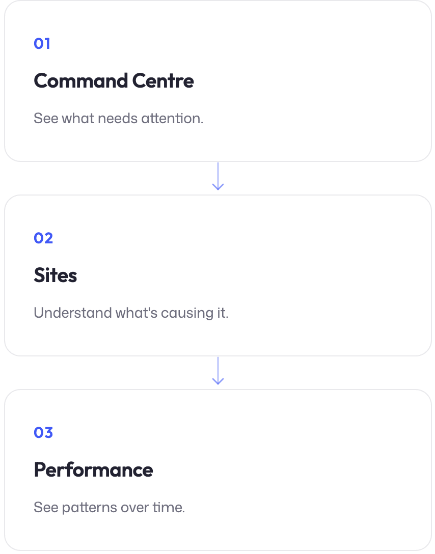
A dashboard can surface a problem without helping the user resolve it. I wanted FlowOps to support the full investigation journey — from recognising that something needs attention to understanding the cause and taking action. The core experience was structured around three stages:
The FlowOps Dashboard
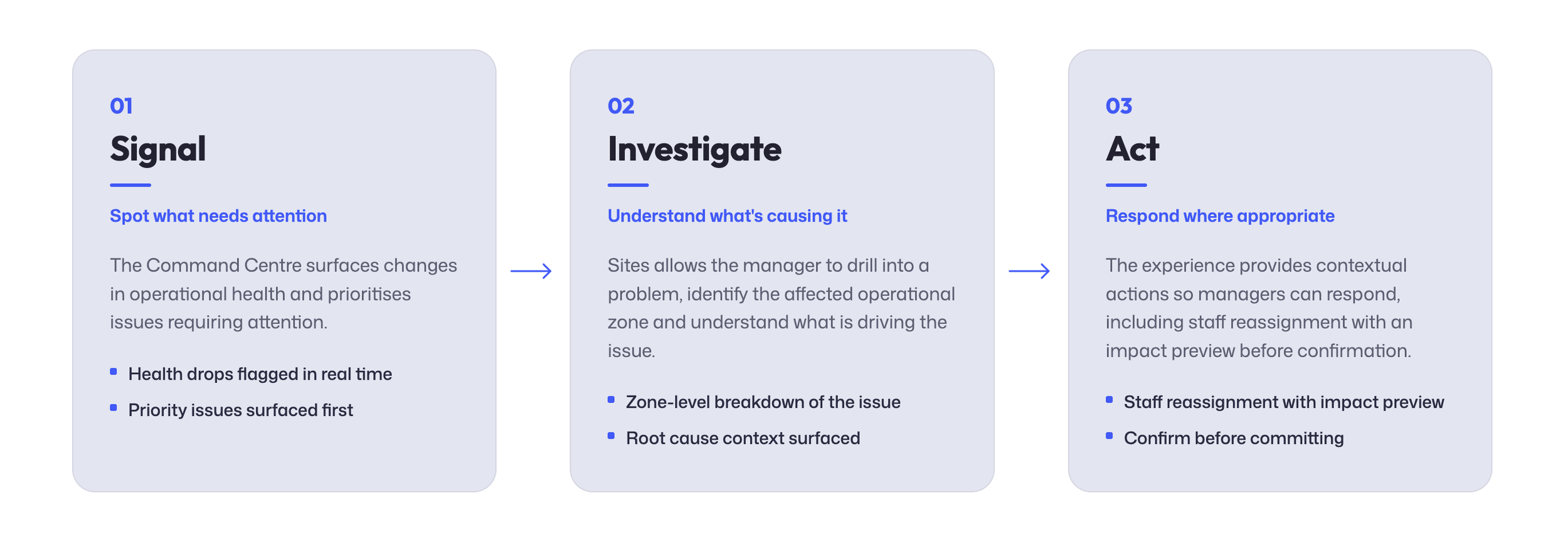
Design principle: Every critical signal should provide a path towards understanding its cause and, where appropriate, taking action.
KEY DECISIONS
Decisions that Shaped the Experience
AI made it quick to explore different options, but I still needed to judge whether they actually worked for the user and decide what needed to change.
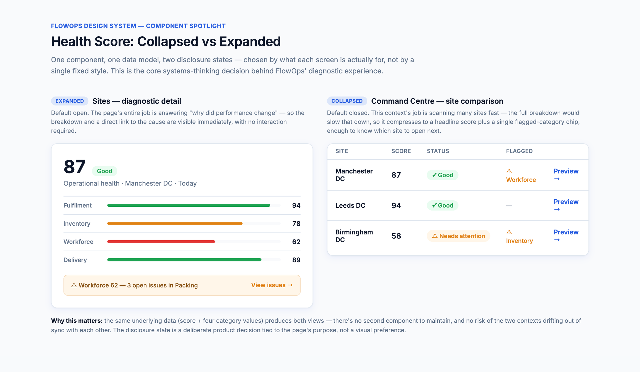
The Problem
The Health Score needed to provide a quick operational signal without becoming a black-box metric.
The Decision
Rather than treating it as one fixed component, I developed it as a progressive disclosure pattern. It remains compact where users are scanning performance, but expands on diagnostic screens to reveal the factors contributing to the score.
Why It Mattered
The same Health Score could now work in two ways, quick to scan on the Command Centre, with more detail when investigating an issue.
1. Making the Health Score Explainable
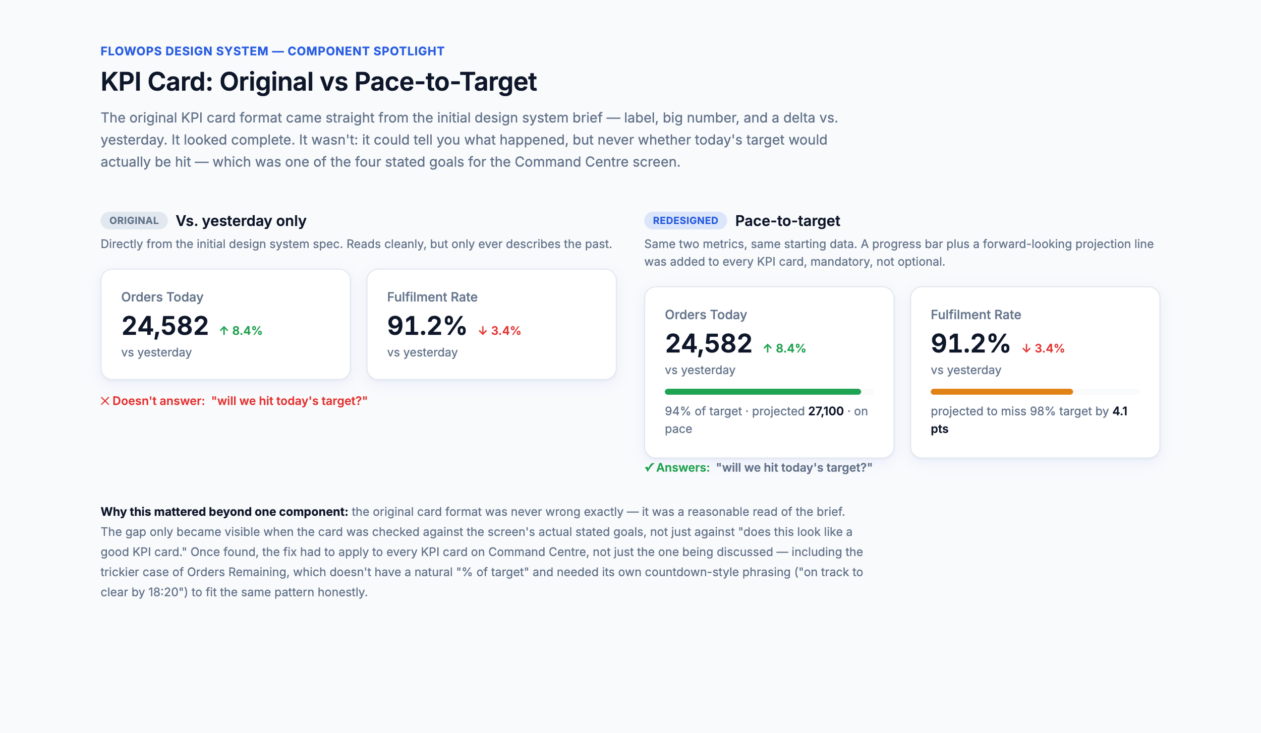
Problem
The original KPI cards compared performance with yesterday. Useful information, but it didn't answer the more important operational question: “Are we on track to hit today's target?”
Decision
The cards evolved to prioritise pace-to-target, giving managers context around where performance is heading rather than simply reporting what has already happened.
Why it mattered
The KPI now helped managers understand where performance was heading, rather than just reporting what had already happened.
2: Designing KPIs around the decision
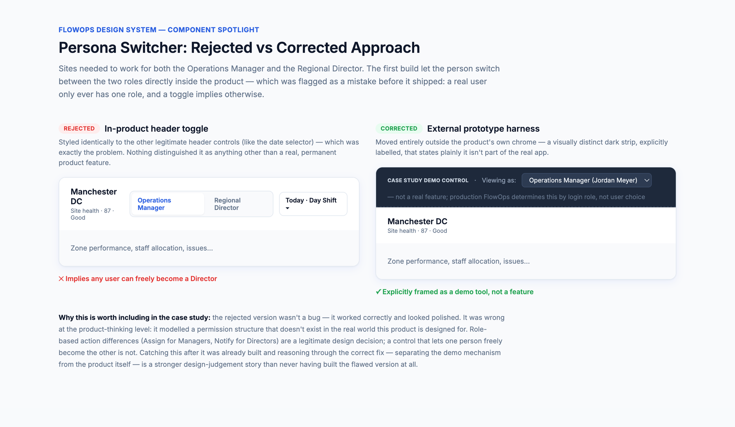
Problem
During exploration, AI introduced an in-product control allowing users to switch between Operations Manager and Regional Director views.
I recognised the flaw: real users wouldn't choose their permissions or role inside the product.
Decision
Role-specific experiences remained, but the switch was removed from the product and moved into an external case-study prototype control. In production, FlowOps would determine the experience from the authenticated user's role. Your final prototype explicitly documents this distinction.
Why it mattered
Fast generation still requires product judgement. A technically functional interaction isn't necessarily a credible product interaction.
3: Correcting unrealistic role behaviour
DESIGNING WITH AI
Prompts
AI accelerated exploration. Judgement shaped the outcome. I used AI as a design collaborator rather than a route to a finished interface. It helped me move quickly from ideas to working alternatives I could evaluate, challenge and refine.
Example 1: Pausing UI generation to define the dashboard hierarchy
What happened
Claude was ready to build the Command Centre before I felt the foundations were clear enough. I stopped interface generation and returned to the dashboard goals and information hierarchy first.
My response
I wanted to define what the experience needs to achieve before deciding what it should look like. The first screen was then generated against an agreed purpose and hierarchy rather than simply assembling dashboard components.
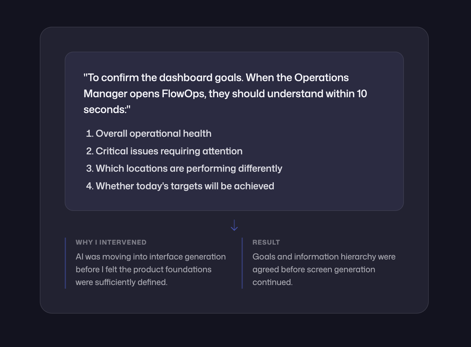
My prompt into Claude.
Example 2: Reordering Sites around critical issues
What happened
The first Sites screen contained the right information, but Critical Issues appeared too far down the page despite being one of the manager's main priorities.
My response in Claude
I moved Critical Issues higher in the hierarchy so problems requiring attention came before supporting operational detail. This brought the screen back in line with the goals we'd defined earlier.
Example 3: Giving FlowOps a more recognisable identity
What happened
By the end of the UX work, the interface looked polished but still felt like it could belong to almost any enterprise dashboard.
My response in Claude
I pushed for a stronger FlowOps identity without making the product decorative. This led to the two-tone ink/blue system, FlowOps monogram and more product-specific navigation language.
DESIGN SYSTEM
Creating Consistency
Once the three screens started taking shape, I could see patterns being repeated across the product. Rather than treating each screen separately, I brought these together into a lightweight FlowOps design system.
It covered the foundations, components and data patterns used across the three views.
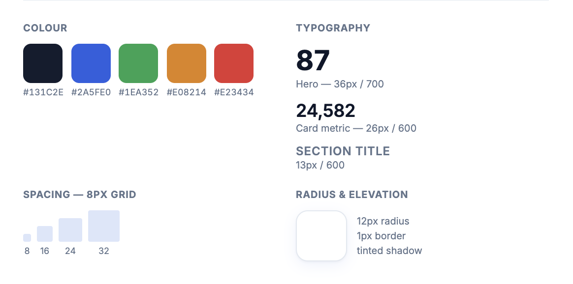
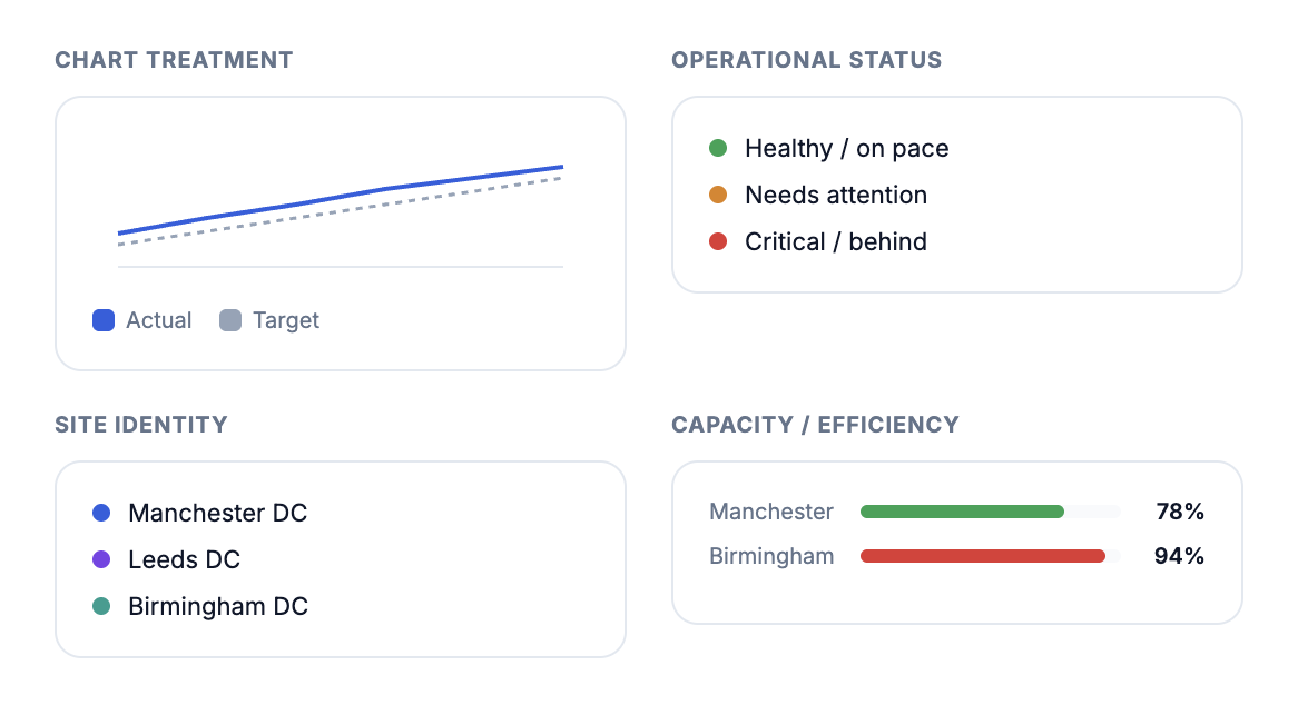
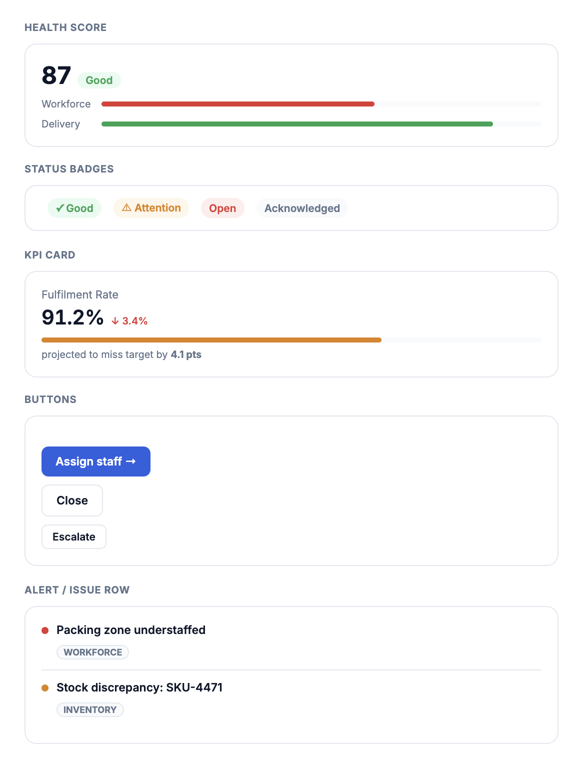
Visuals supplied by Claude.
THE FINAL EXPERIENCE
The final concept brings the core FlowOps experience together across three views, with the Command Centre adapting to the current operational state, helping managers understand what needs attention, investigate what's causing it and look at performance over time.
Final Concept
Command Centre - Attention Needed
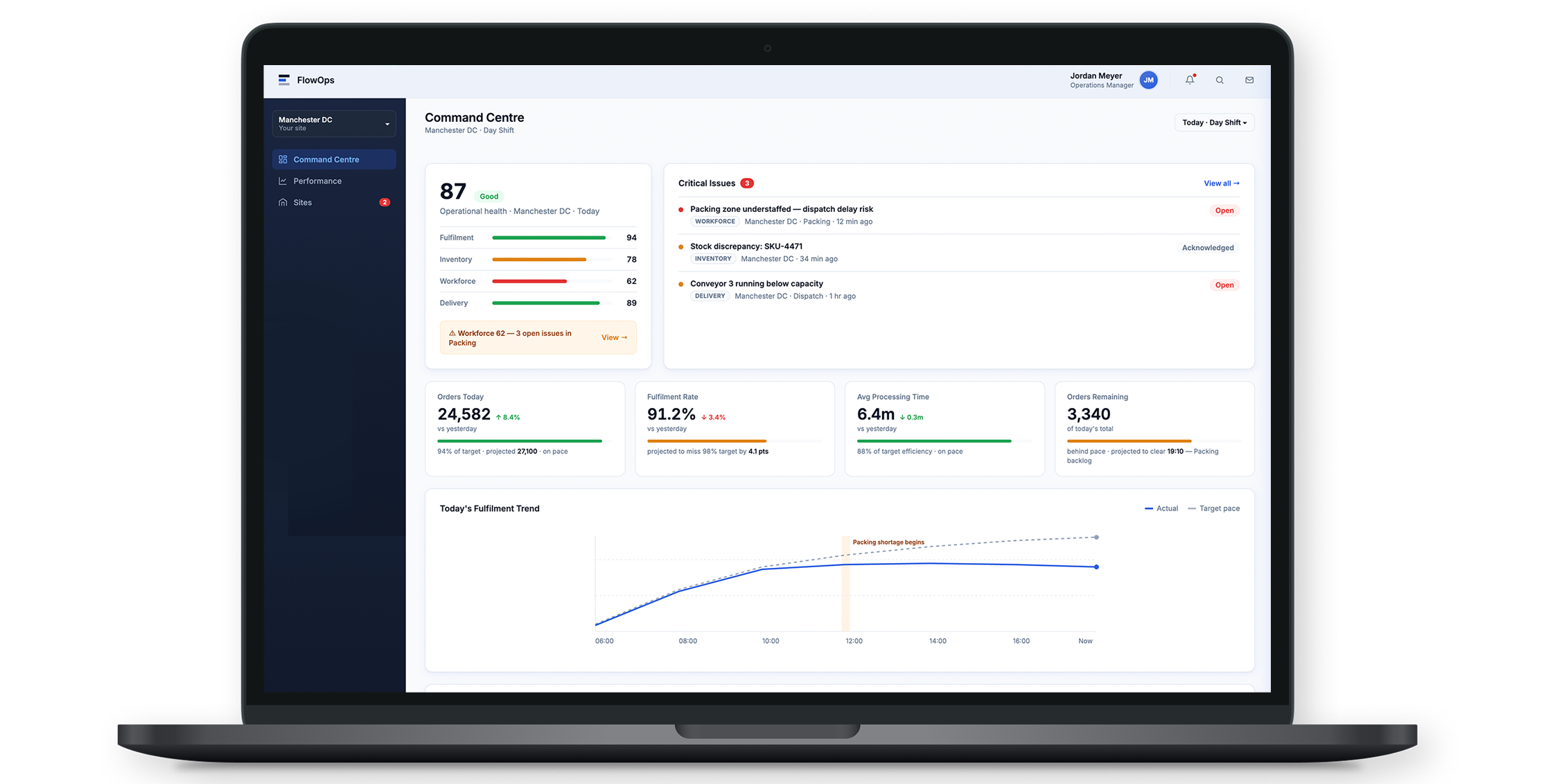
Operational health, critical issues and progress towards today's targets are brought together so the manager can quickly see where they need to focus.
Command Centre - All Clear
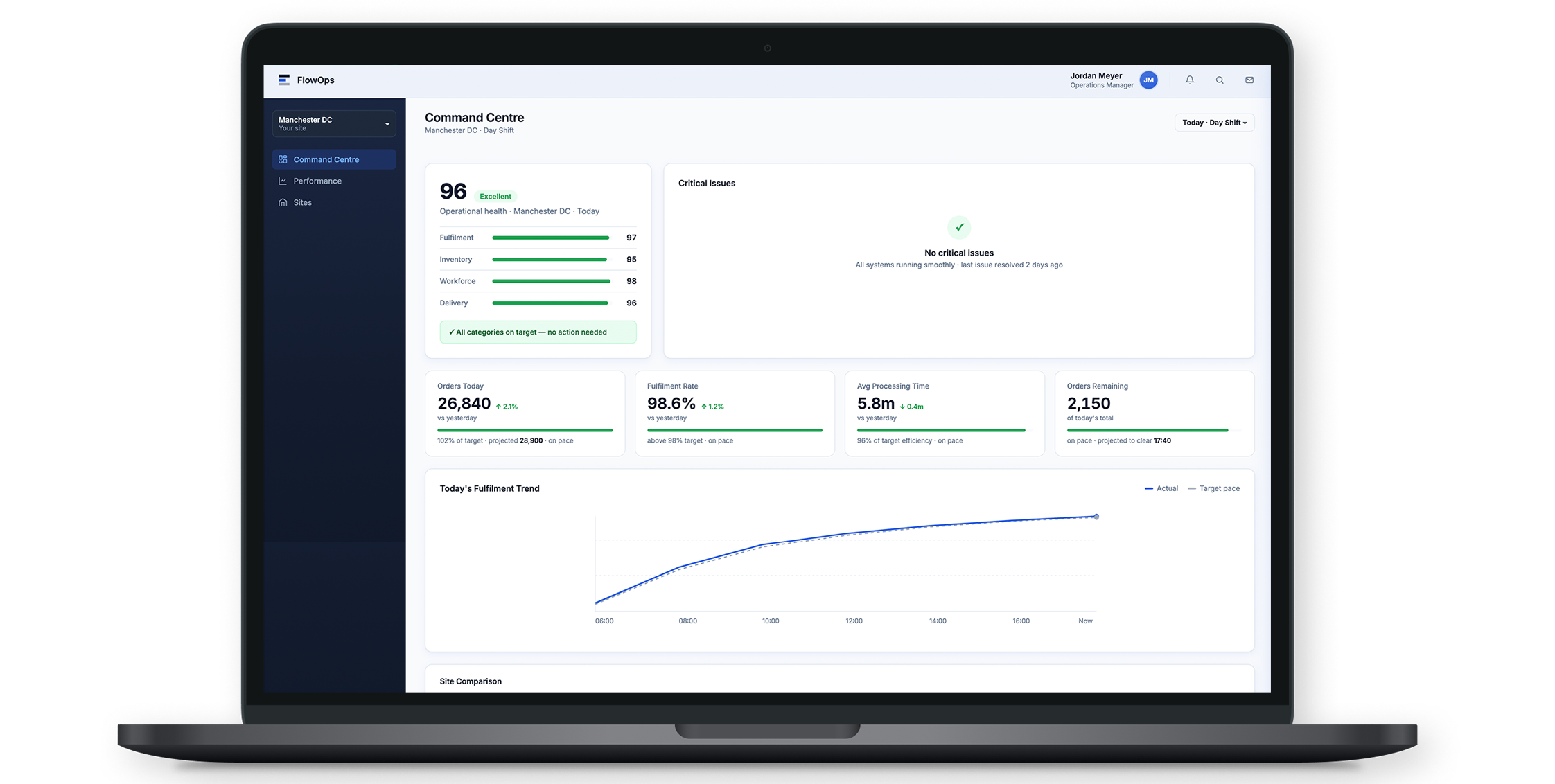
The same dashboard adapts when there are no immediate issues, giving the manager reassurance without creating unnecessary urgency.
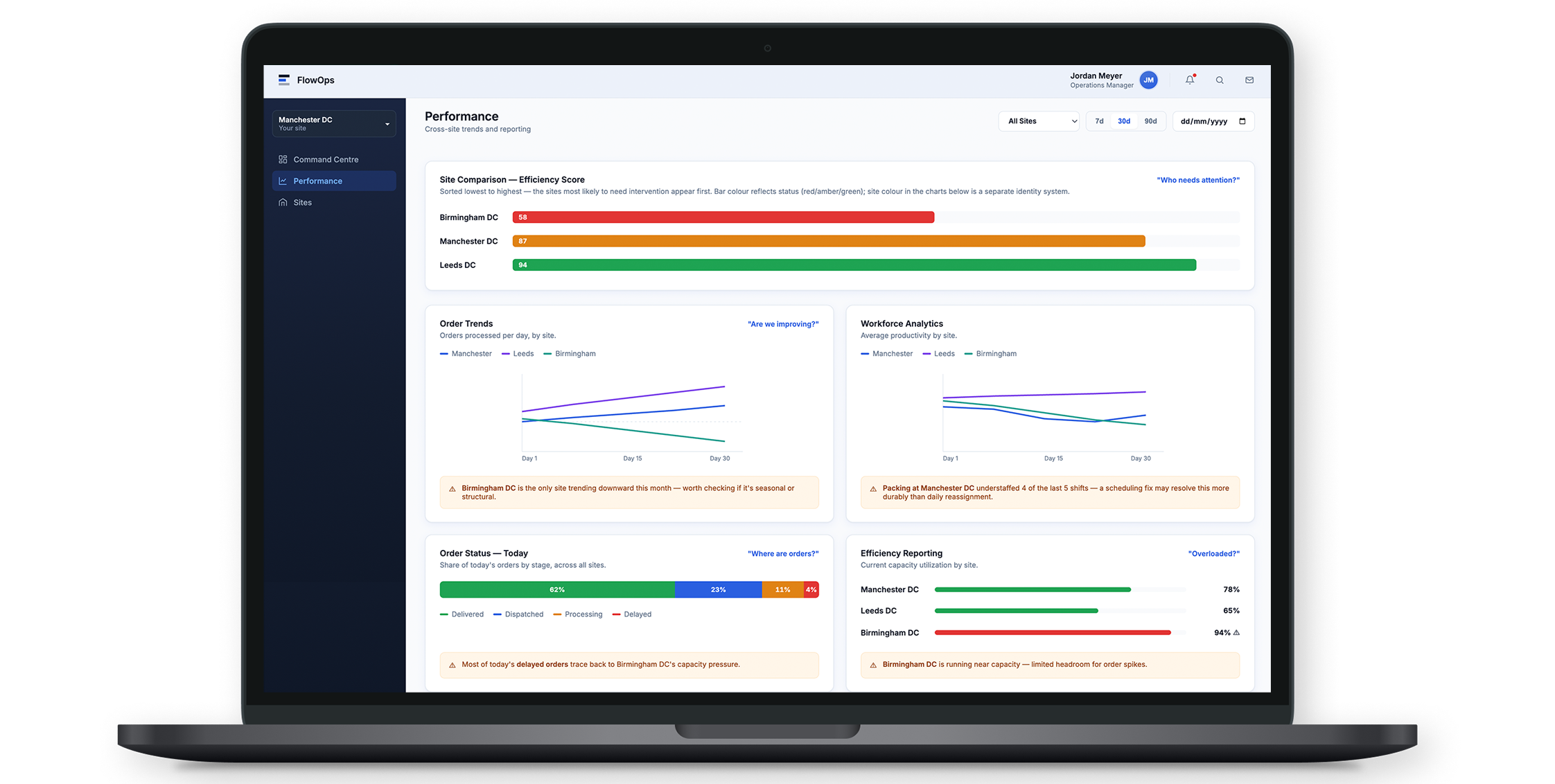
Performance - Looking beyond today
Cross-site comparisons and trends help users spot recurring patterns and understand performance over a longer period.
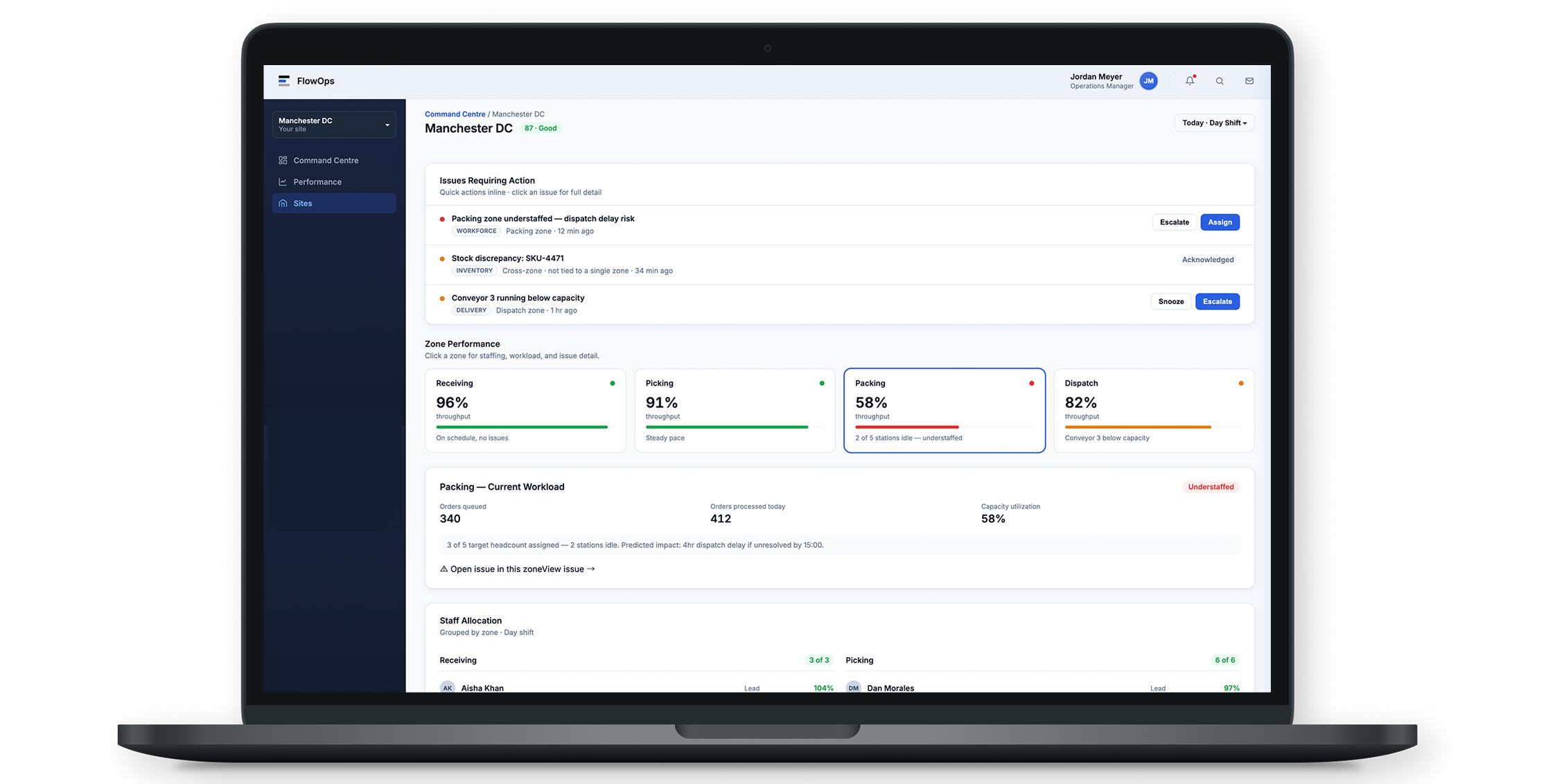
Sites - Investigating Issues
Managers can move into an individual site, understand which operational area is causing the problem and take action where needed.
THE FINAL EXPERIENCE
What I took from the project
FlowOps started as an exercise in seeing how far AI could accelerate my design process but the biggest benefit wasn't simply producing screens faster.
Being able to turn an idea into something I could see and respond to quickly meant I could explore more options, spot problems earlier and keep refining rather than settling on the first solution.
It also reinforced that AI still needs direction. There were several points where I slowed the process down, challenged what had been generated or changed direction because something didn't make sense from a product or UX perspective.
Reflections
What I'd take further
If FlowOps was moving towards a real product, the next step would be to take the experience beyond the core journeys explored here. I'd look at:
Testing the main workflows with Operations Managers
Accessibility and keyboard behaviour in more detail
Empty, loading and error states
Responsive behaviour
Expanding the design system as new product areas were introduced
The project has given me a useful way of thinking about AI in my design process: use the speed to explore more, while keeping the judgement and decision-making with the designer.