
Exploring Accessibility in Payroll
My Role: Product Designer
Tools: Claude
Duration: 0.5 day
Focus: Accessibility, WCAG 2.1 AA, Interaction Design
01 Overview
02 Challenge
03 Approach
04 Testing
05 Accessibility In Mind
OVERVIEW
I wanted to challenge my understanding of accessibility in a more demanding product context, so I explored how I would approach a payroll workflow where getting the interaction wrong could have real consequences for a user.
I chose changing bank details, a simple task on the surface, but one where clarity, error prevention, feedback and accessibility all matter.
This was a personal case study prompted by my interest in designing more accessible, trustworthy SaaS experiences.
A Recent Design Exploration Into Accessibility, Trust and Error Prevention in a High-Stakes Workflow.
THE CHALLENGE
Changing bank details should be straightforward. But there are several points where the experience can fail:
A user enters incorrect information
An error isn't clearly explained
A keyboard user can't navigate the form easily
Important feedback isn't communicated clearly
A user isn't confident that their change has been saved
A consequential action is completed without sufficient reassurance
I wanted to explore these scenarios rather than designing only the happy path.
How Might We Make Changing Bank Details Simple, Accessible and Trustworthy?
MY APPROACH
Starting with the Interaction
I started with a simple journey: Enter Details > Review > Confirm.
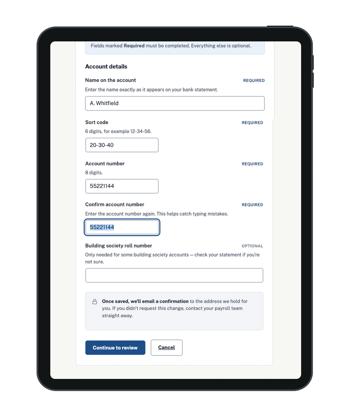
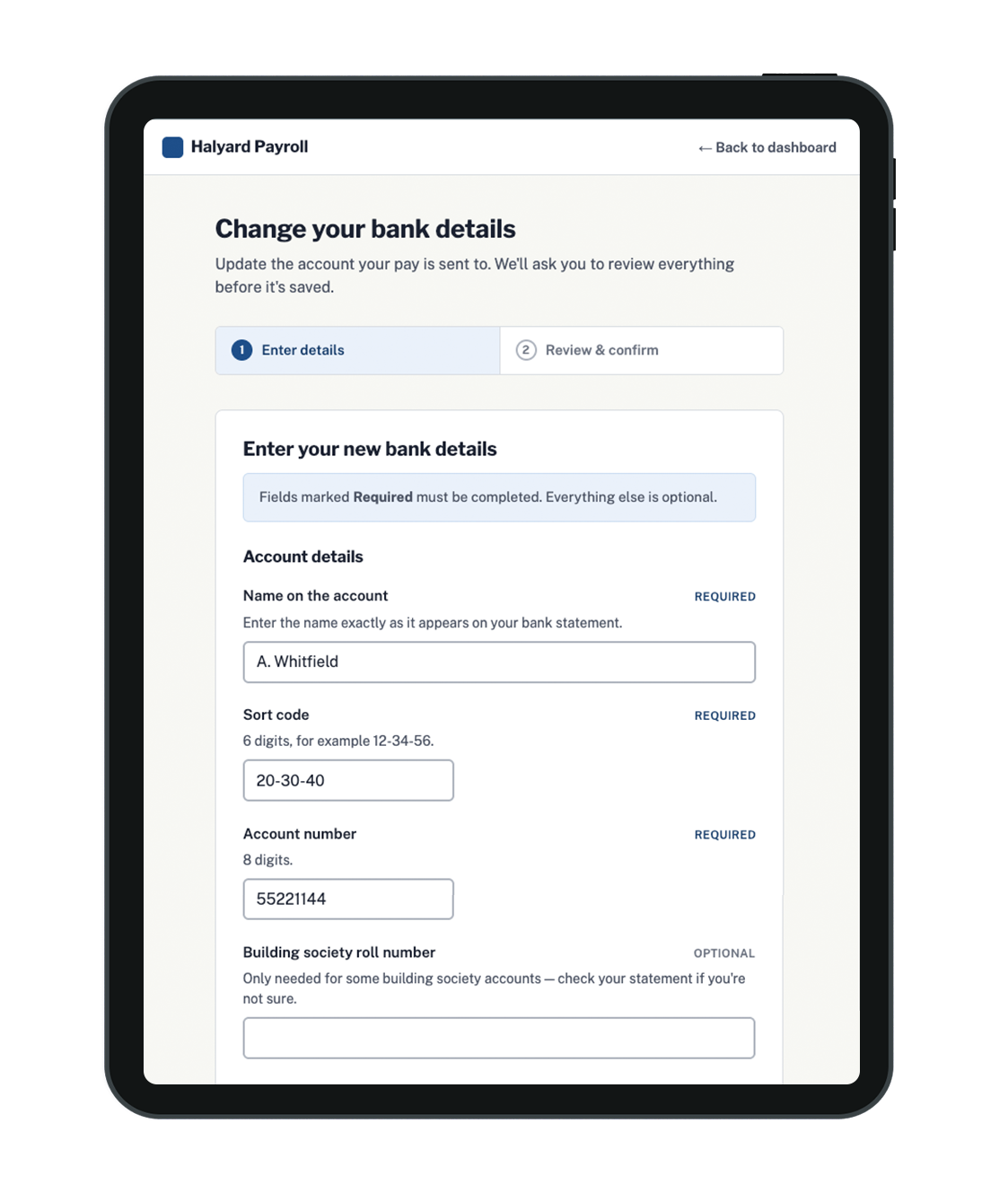
Rather than focusing on visual styling, I considered how someone could move through the task confidently — including clear labels and guidance, keyboard navigation, visible focus and understandable feedback.
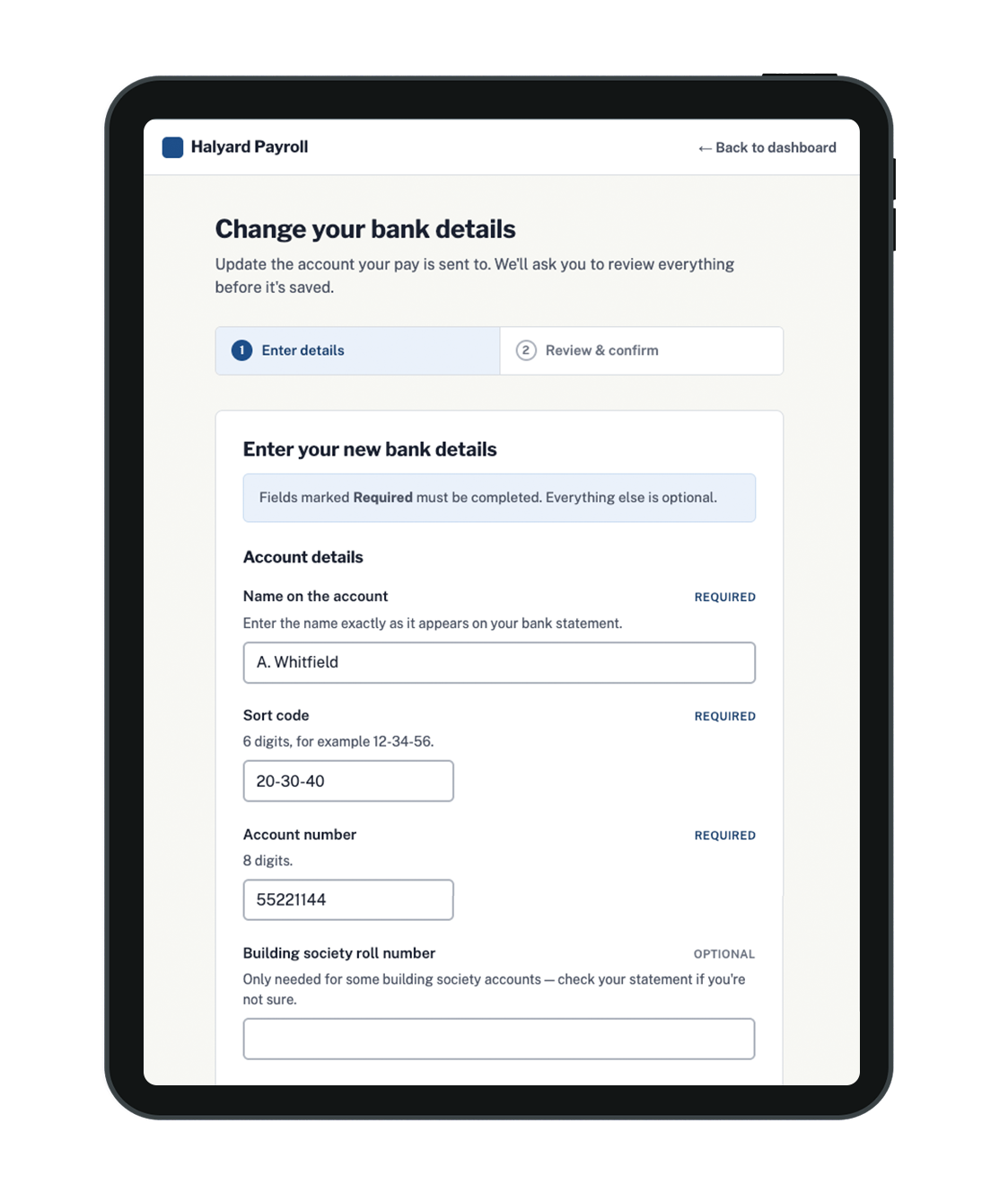
Step 1: Enter Details
Persistent, clearly associated field labels
Supporting guidance provided before errors occur
Clear, visible keyboard focus state
Logical content and form hierarchy
Designing For Error and Recovery
Errors need to help someone recover, not simply tell them something is wrong. Instead of generic messages such as “Invalid account number”, I used specific guidance such as “Enter an 8-digit account number.”
Error states also use more than colour alone to communicate what needs attention.
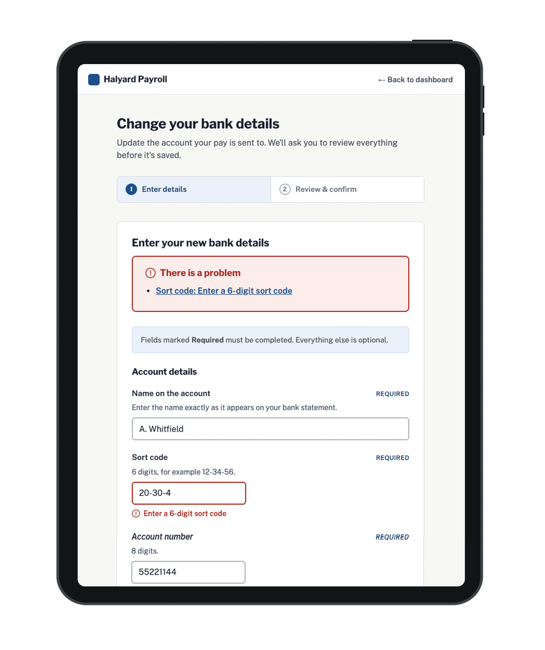
Step 1: Error State
Specific, actionable error message
Error communicated through more than colour alone
Error clearly associated with the affected field
Guidance helps the user understand how to recover
Designing For Confidence
Changing bank details is consequential. The user needs to know:
What am I changing?
What will happen when I confirm?
Has the change been successful?
When will it take effect?
Changing bank details is consequential, so the experience needs to give users confidence before and after they commit the change.
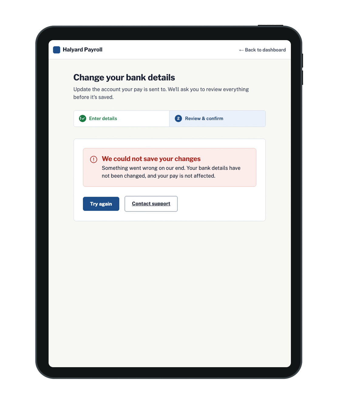
The review step makes the new details easy to check while masking information that isn't needed for the decision. Confirmation and failure states then clearly explain what happened and, where necessary, what the user can do next.
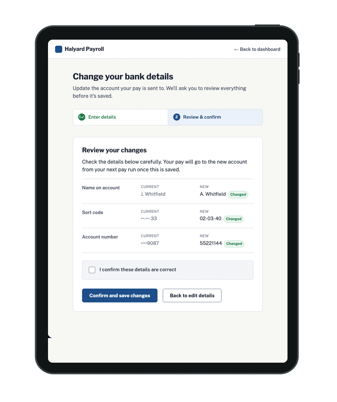
Step 2: Review
Current bank details masked to reduce unnecessary information
New details clearly visible for checking
Clear distinction between current and new information
Review step helps prevent errors before a consequential change
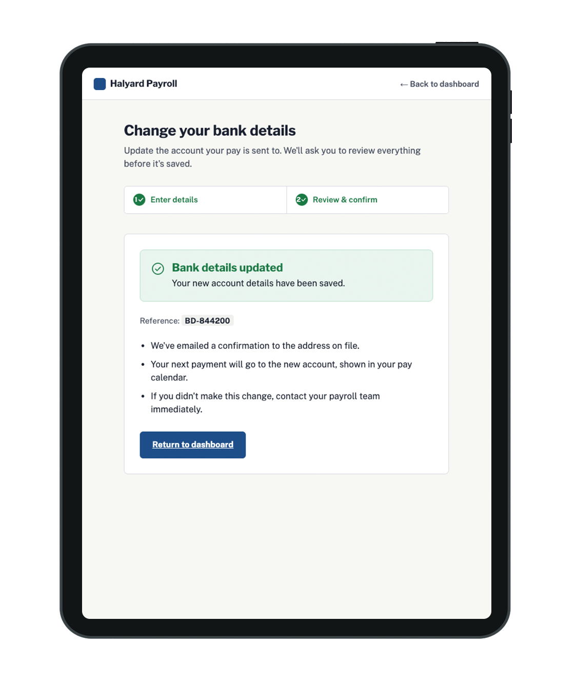
Step 3: Confirm (Success)
Clear confirmation that the action succeeded
Explains what happens next / when the change takes effect
Strong status hierarchy without relying solely on colour
Reassurance without unnecessary content
Step 3: Confirm (Error)
Explains what went wrong, reassurance that pay isn't affected
Clear routes to recover
TESTING
Testing Uncovered Something I Hadn't Considered
One issue only surfaced through testing, not planning.
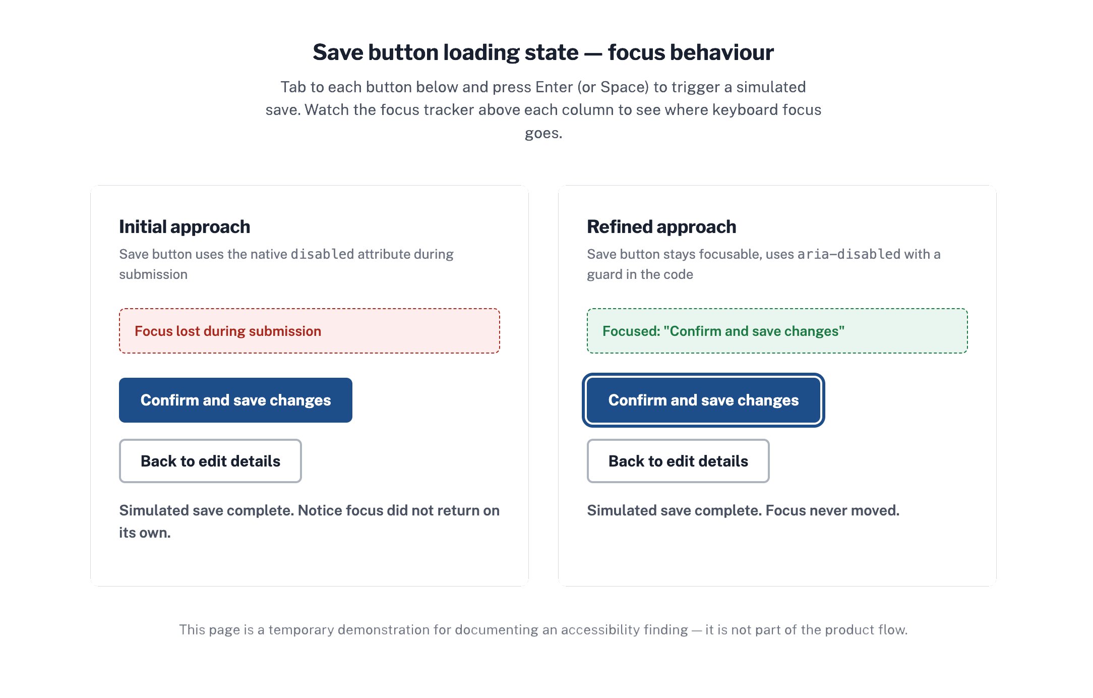
During submission, the Save button used the native disabled attribute. Testing the interaction with keyboard navigation exposed an unintended consequence: the control was no longer focusable and the user's position in the interface was lost.
I refined the interaction so the button remained focusable, communicated its unavailable state, preventing repeat submission.
A pattern can look correct visually while behaving very differently for someone navigating with a keyboard.
REVIEW
Designing with Accessibility in Mind
WCAG 2.1 AA considerations:
Keyboard navigation and visible focus
Clear labels and instructions
Colour contrast
Avoiding colour as the only way to communicate meaning
Accessible validation and error messaging
Logical information hierarchy
Clear feedback and recovery
Zoom and responsive behaviour
Screen-reader considerations
Clearer instructions, predictable navigation and more useful error messages aren't just accessibility features, they reduce uncertainty for all users.
Reflection
Accessibility isn't a layer added to a finished interface. It can fundamentally change how the interaction should work.
It challenged me to think beyond the happy path. In a high-stakes product such as payroll, error prevention, reassurance and recovery are core parts of the product experience.
AI helped me explore more quickly. Design judgement determined what stayed.